
CASE STUDY | 2021-22
Code For Fun
Code For Fun
Contributions:
UX Research
Branding
Strategy & Features
UI Design
Visual Design
Copywriting
Contributions:
UX Research
Branding
Strategy & Features
UI Design
Visual Design
Copywriting
Contributions:
UX Research
Branding
Strategy & Features
UI Design
Visual Design
Copywriting
Team:
Mazhar Bagasrawala - Product Design
Servane Demol - Founder & Director
Naman Nair - Board Member, Engineering
Hélène Gsell - Head of Marketing
Team:
Mazhar Bagasrawala - Product Design
Servane Demol - Founder & Director
Naman Nair - Board Member, Engineering
Hélène Gsell - Head of Marketing
Team:
Mazhar Bagasrawala - Product Design
Servane Demol - Founder & Director
Naman Nair - Board Member, Engineering
Hélène Gsell - Head of Marketing
Location:
SF Bay Area, USA
Location:
SF Bay Area, USA
Location:
SF Bay Area, USA
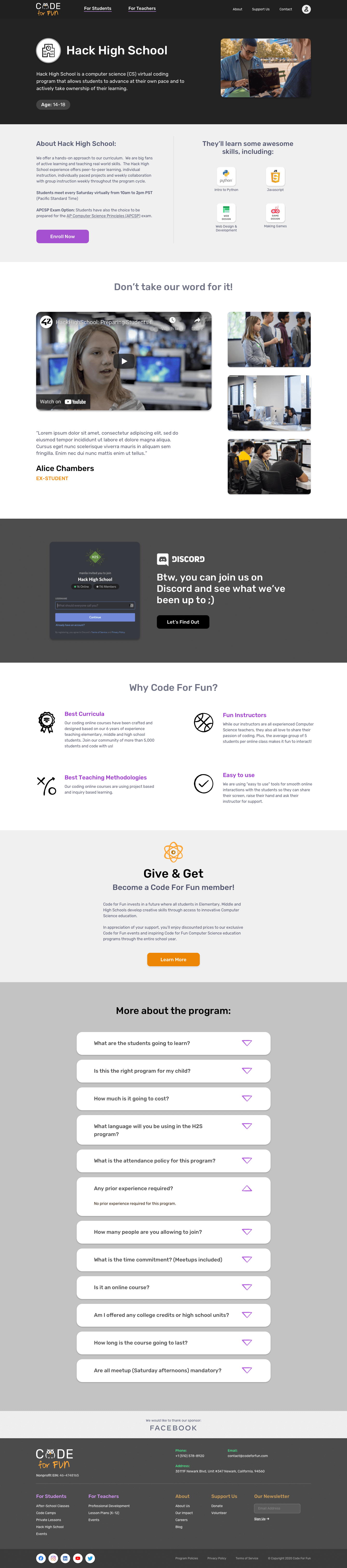
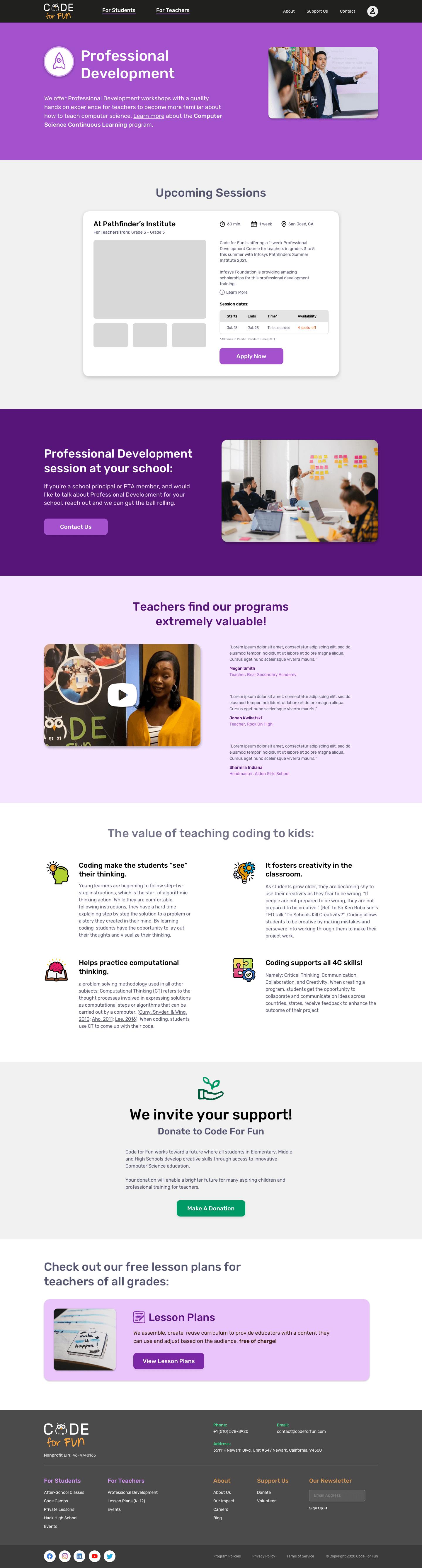
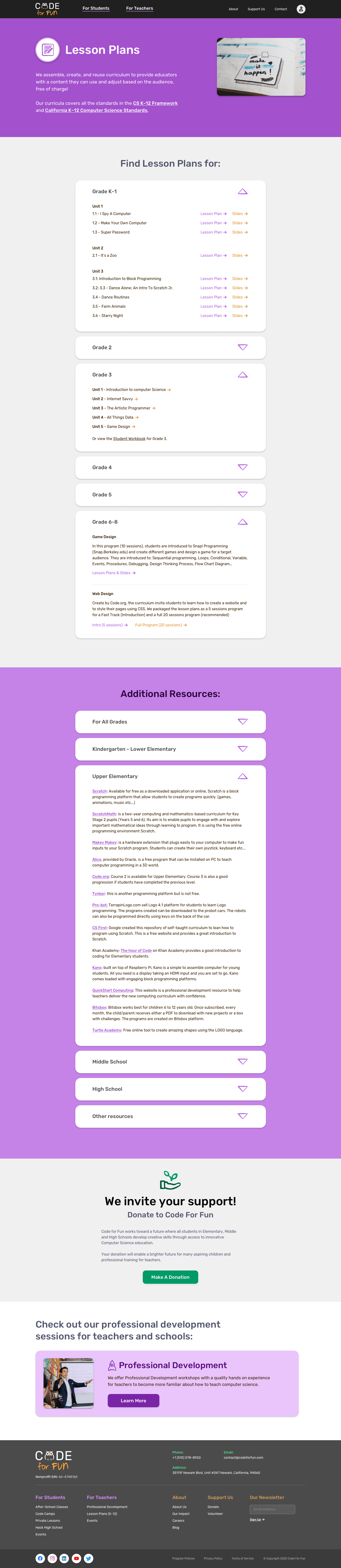
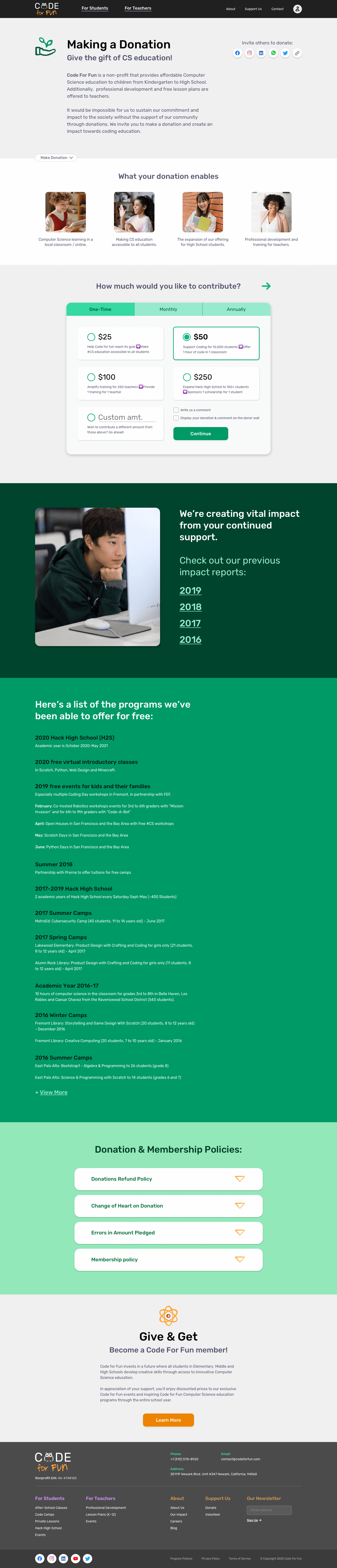
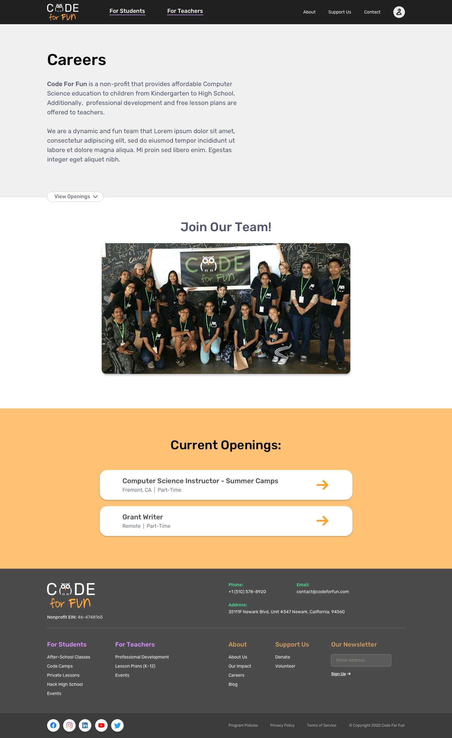
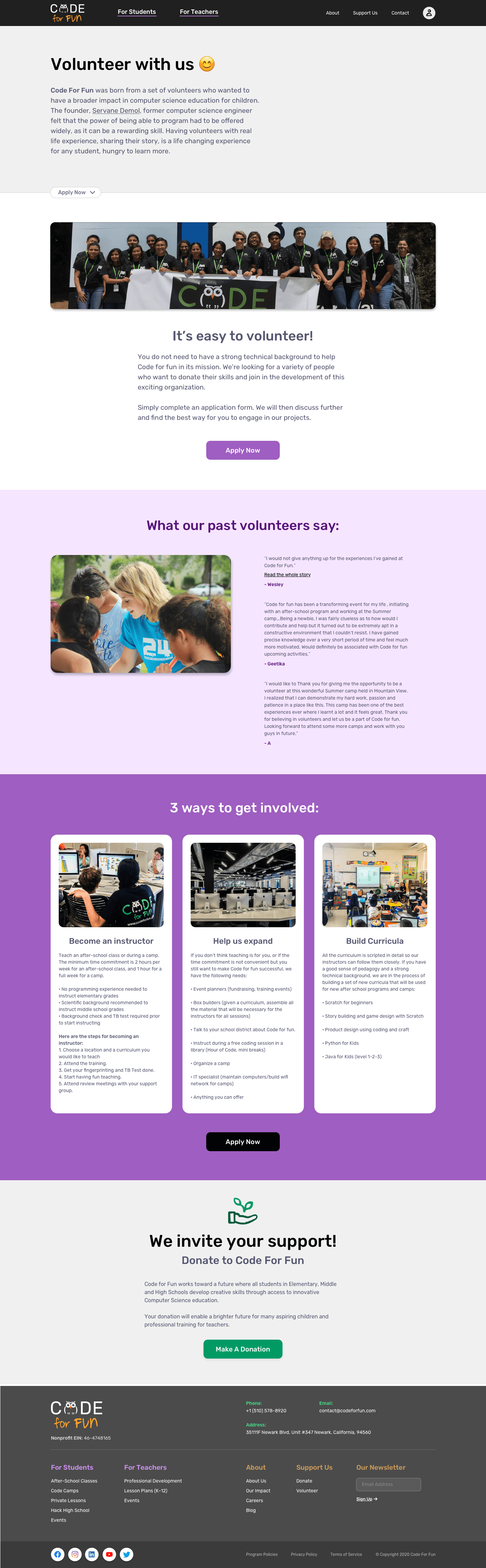
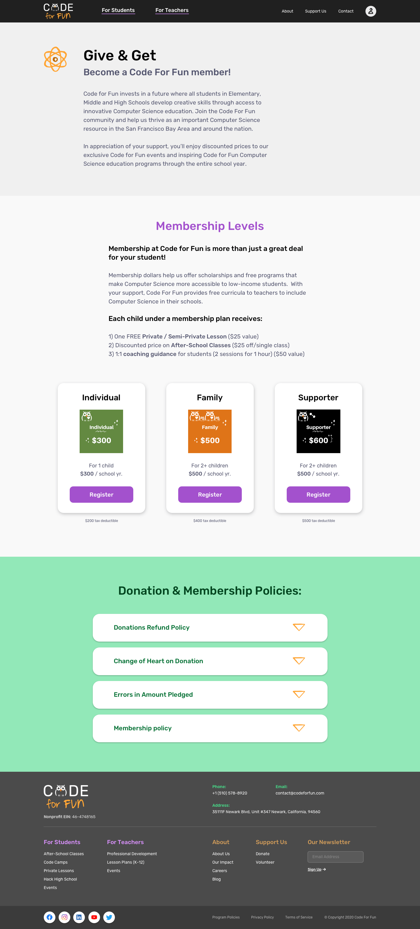
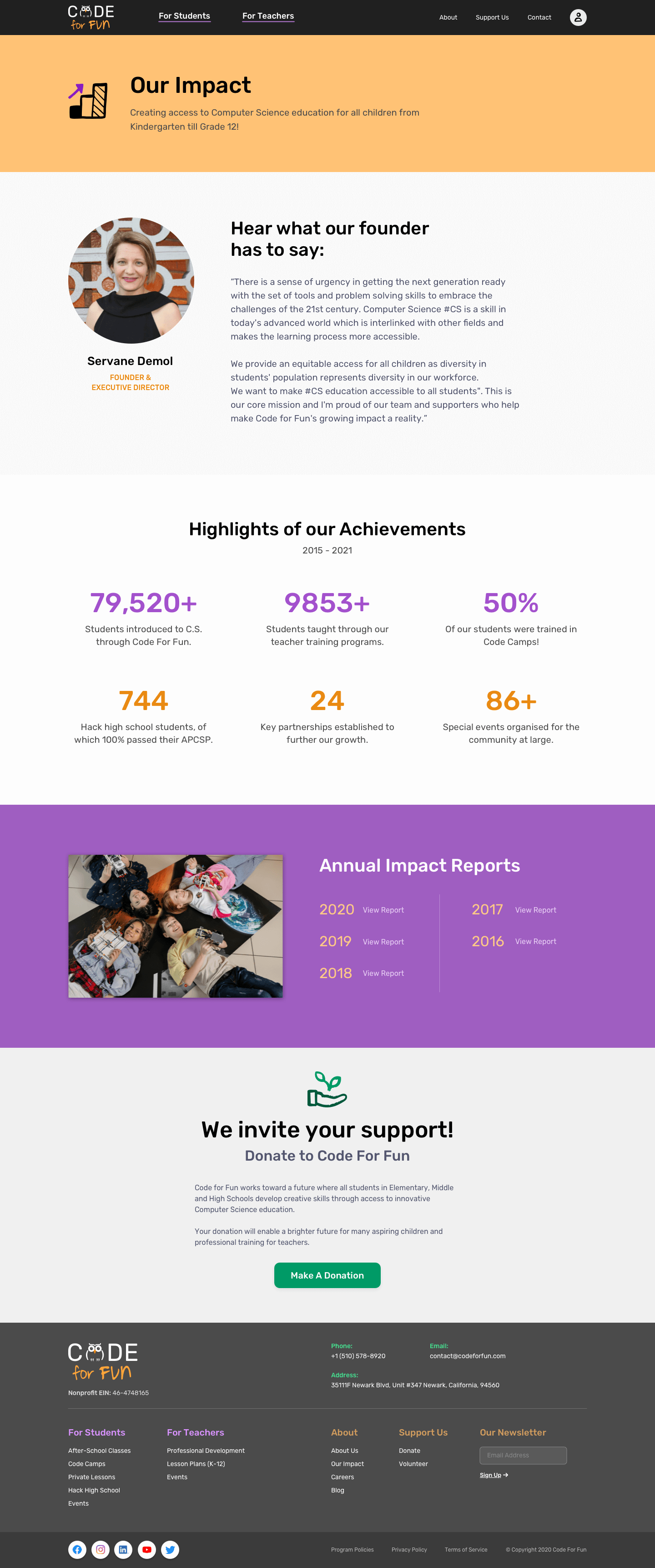
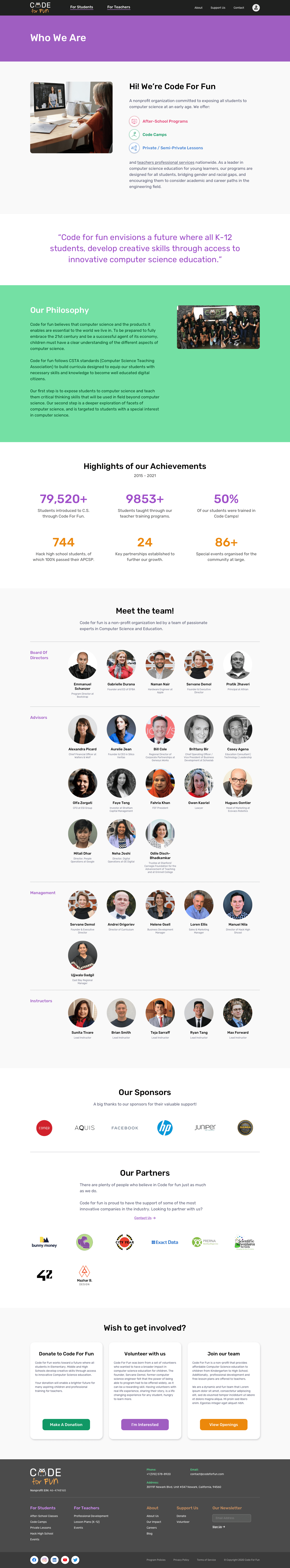
Code For Fun is a non-profit organization providing innovative computer science education to K-12 students, and professional development for teachers.
Code For Fun is a non-profit organization providing innovative computer science education to K-12 students, and professional development for teachers.
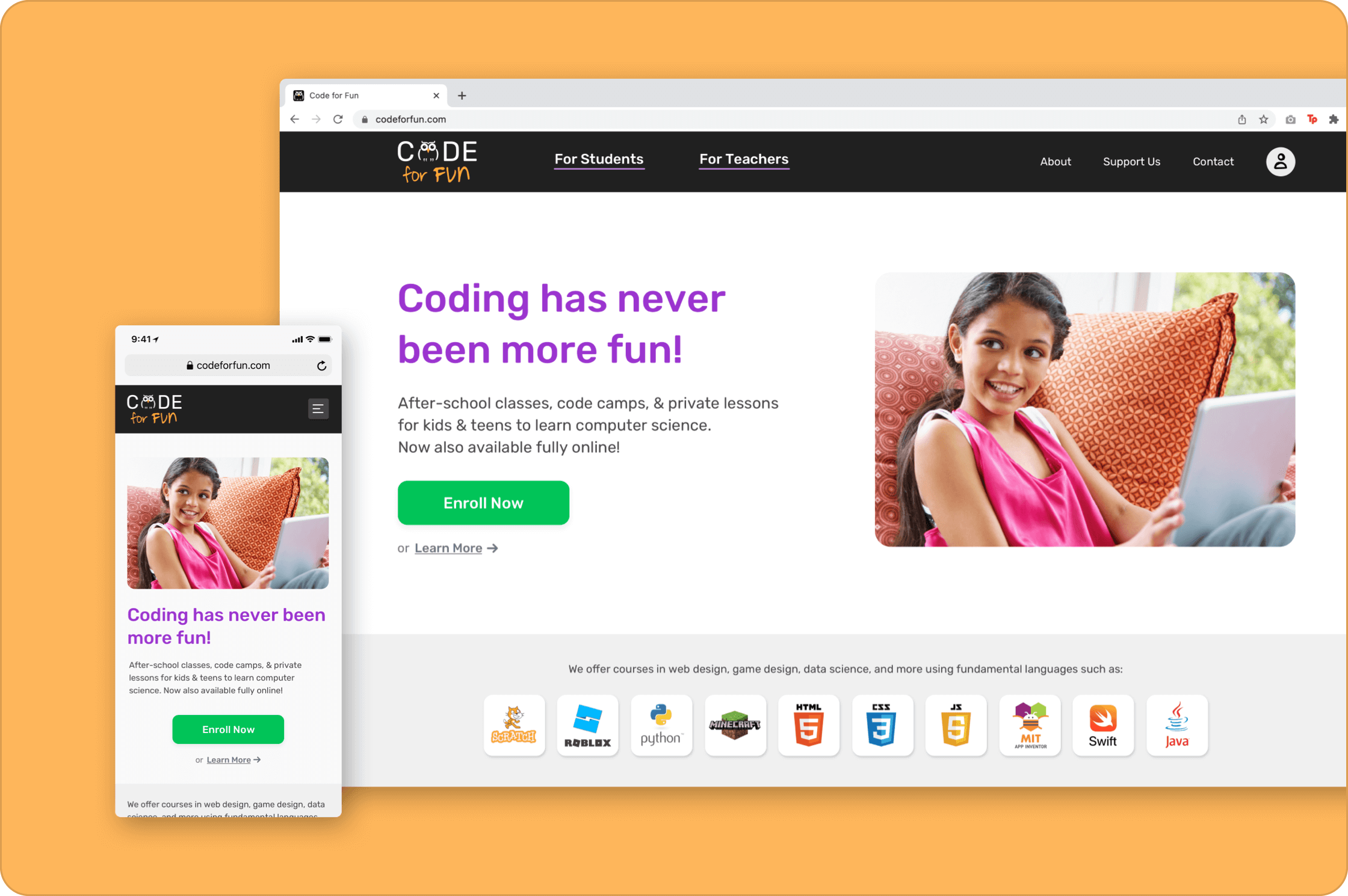
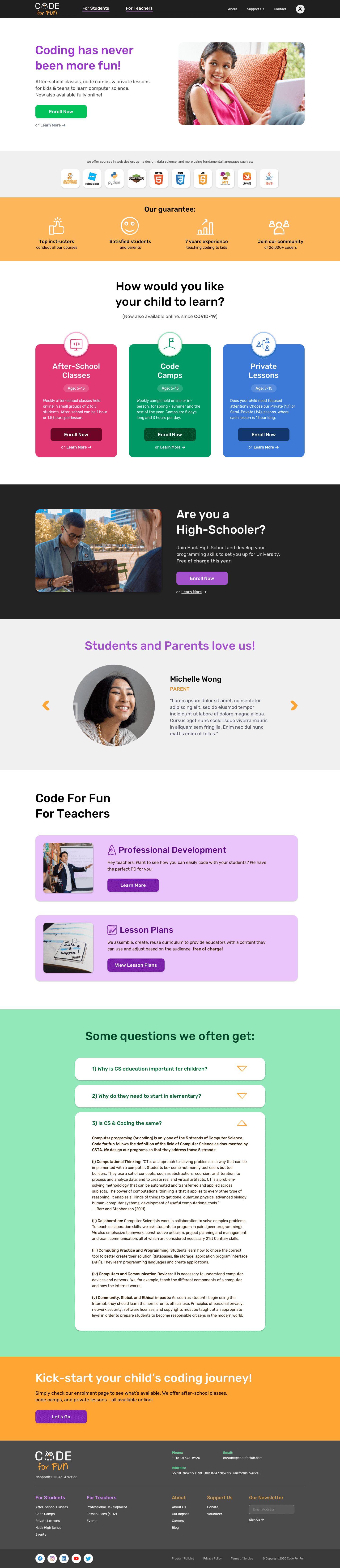
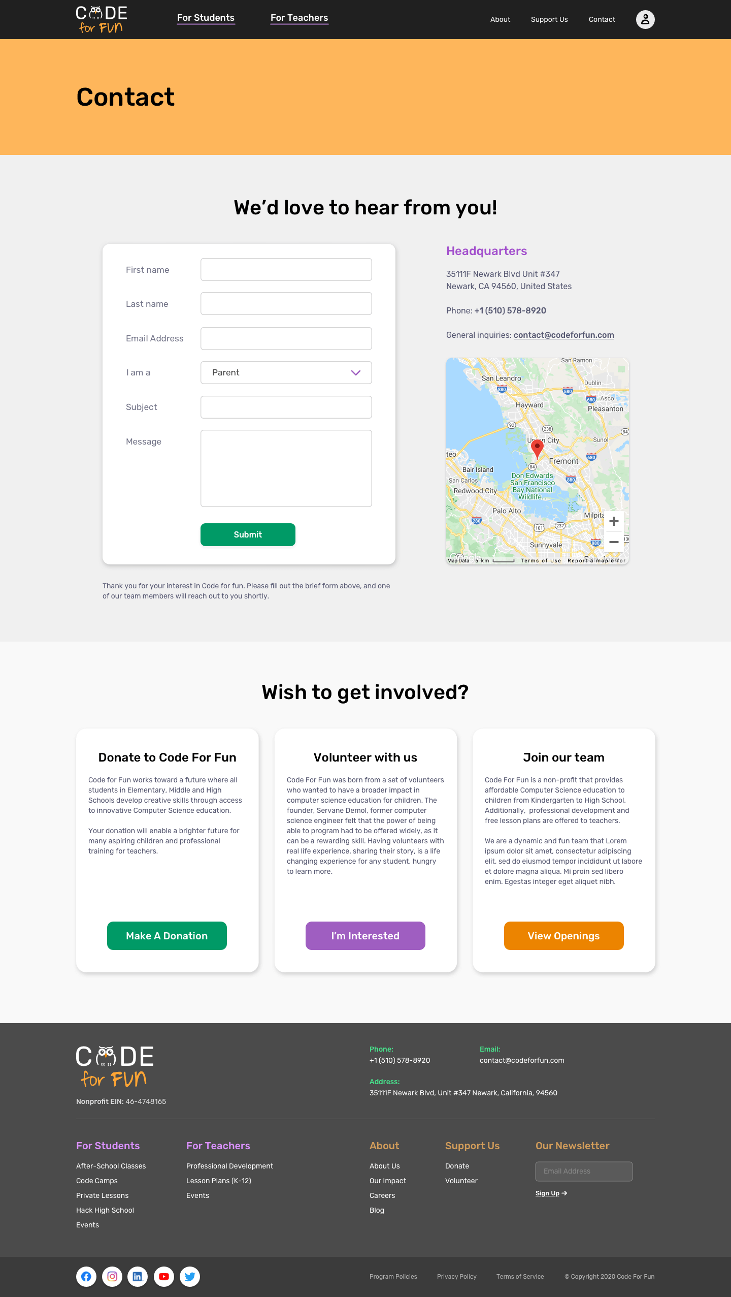
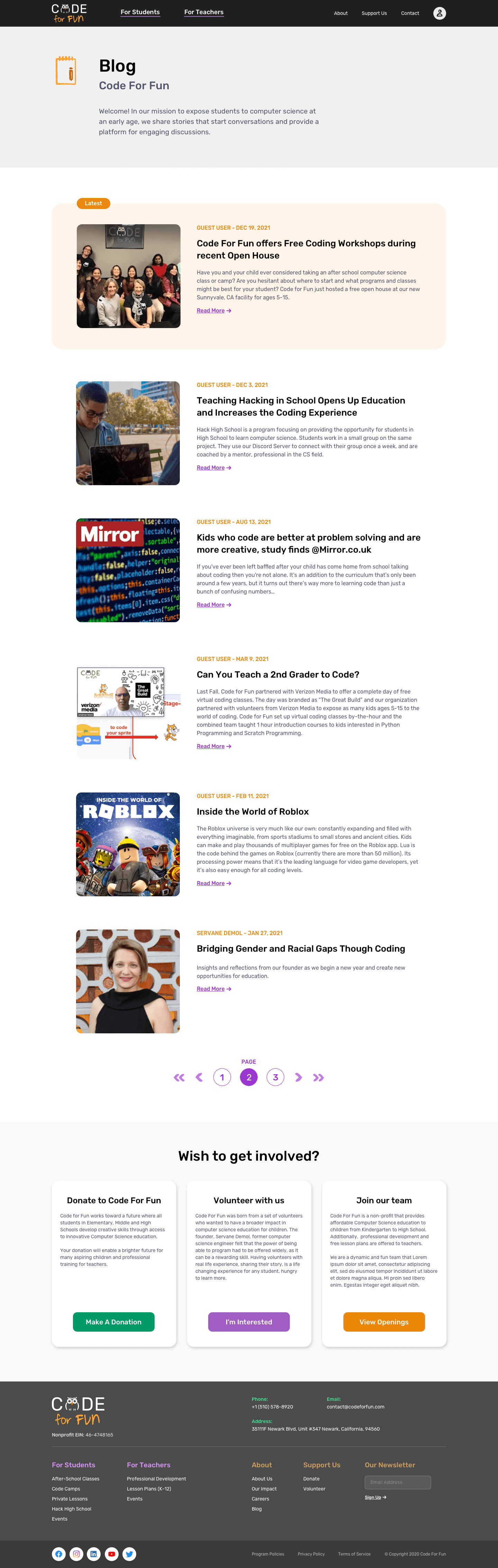
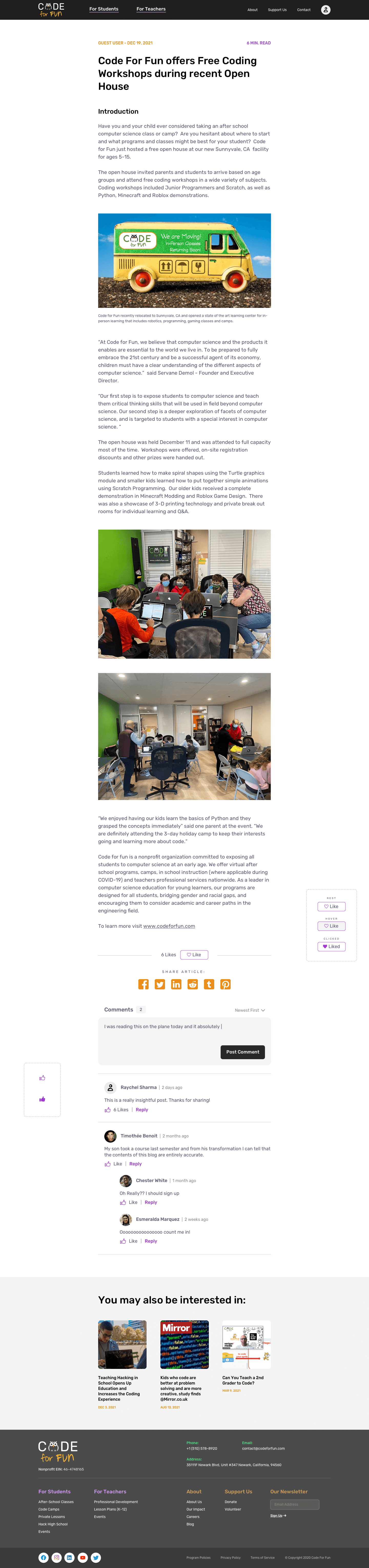
Wesbite hero section redesign, as seen on mobile and desktop.
Background
Customer Problem ?
Servane explained that her customers were struggling to find information, book courses without contacting support, had no way to manage their enrolled courses online, and did not have a very high opinion of the website when polled.
Our Users ?
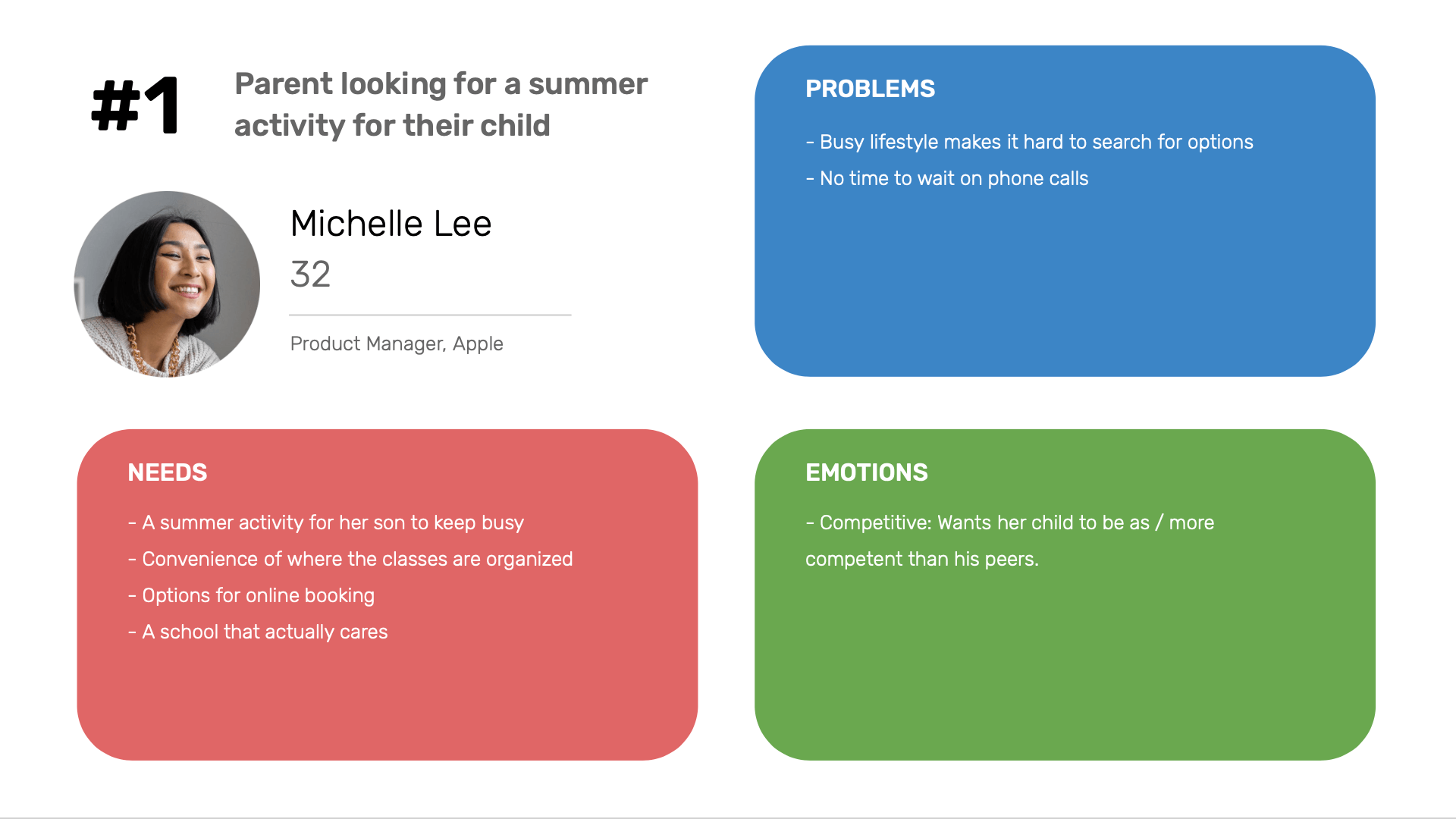
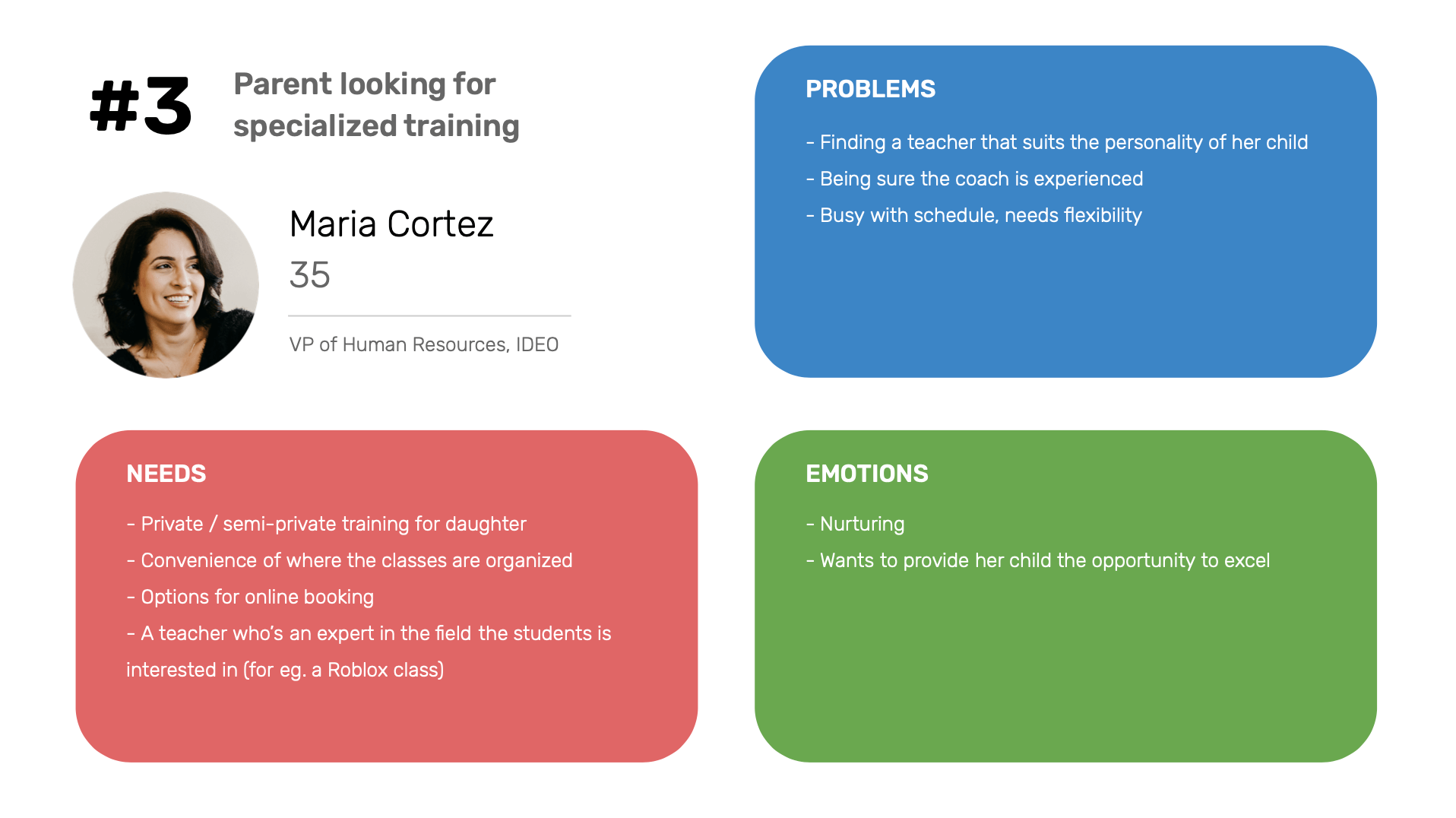
Parents of K-12 students
High school students
Teachers of computer science
Goal ?
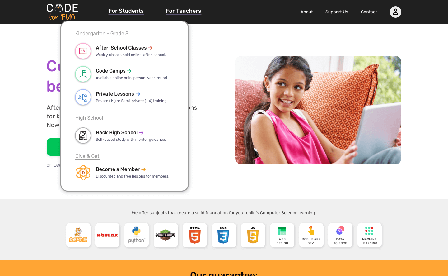
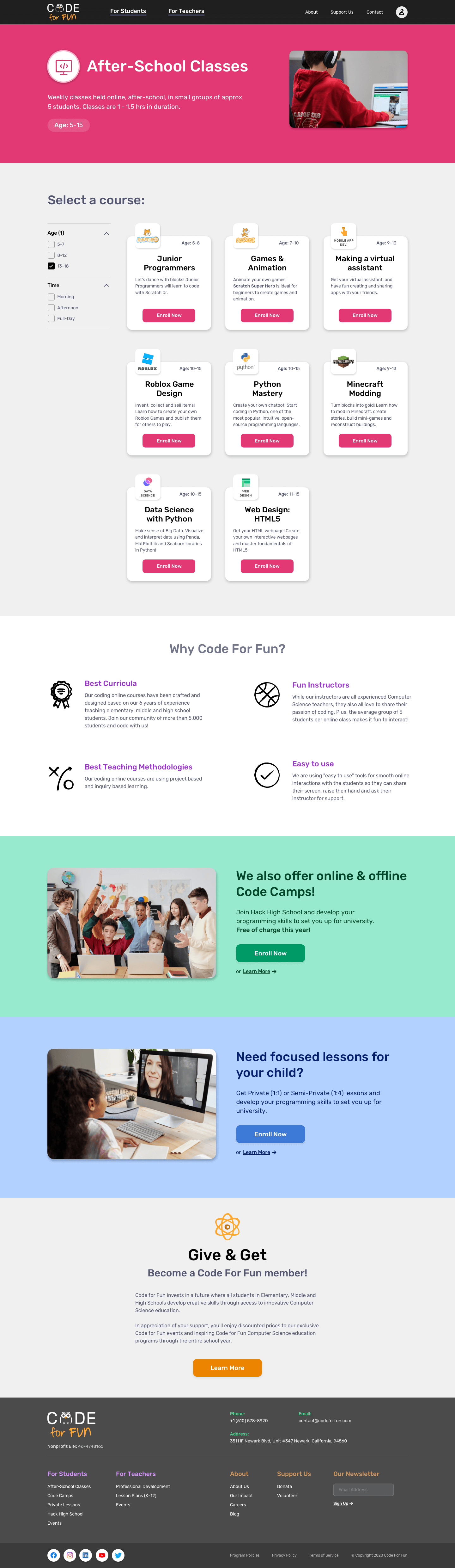
To redesign the Code For Fun website improving UX and visual design across static pages, course discovery & registration and introduce an all-new account dashboard to bring about:
- Improved brand image & perception
- Uptick in student enrolment
- More organic donations to CFF
- Increased buzz about the organization
Original Design
The original website had a handful of UX challenges including, but not limited to:
- Offerings not clearly presented
- Accessibility concerns
- No evident call to action
- Navigational challenges
- Scattered information architecture
- Unappealing visual language
- Text-heavy, not enough imagery
- Readability issues resulting from poor typography
- The design does not do justice to CFF's powerful vision and capabilities
- Misrepresentative brand image
- Experientially inadequate compared to other products customers frequent
- Outdated UI patterns
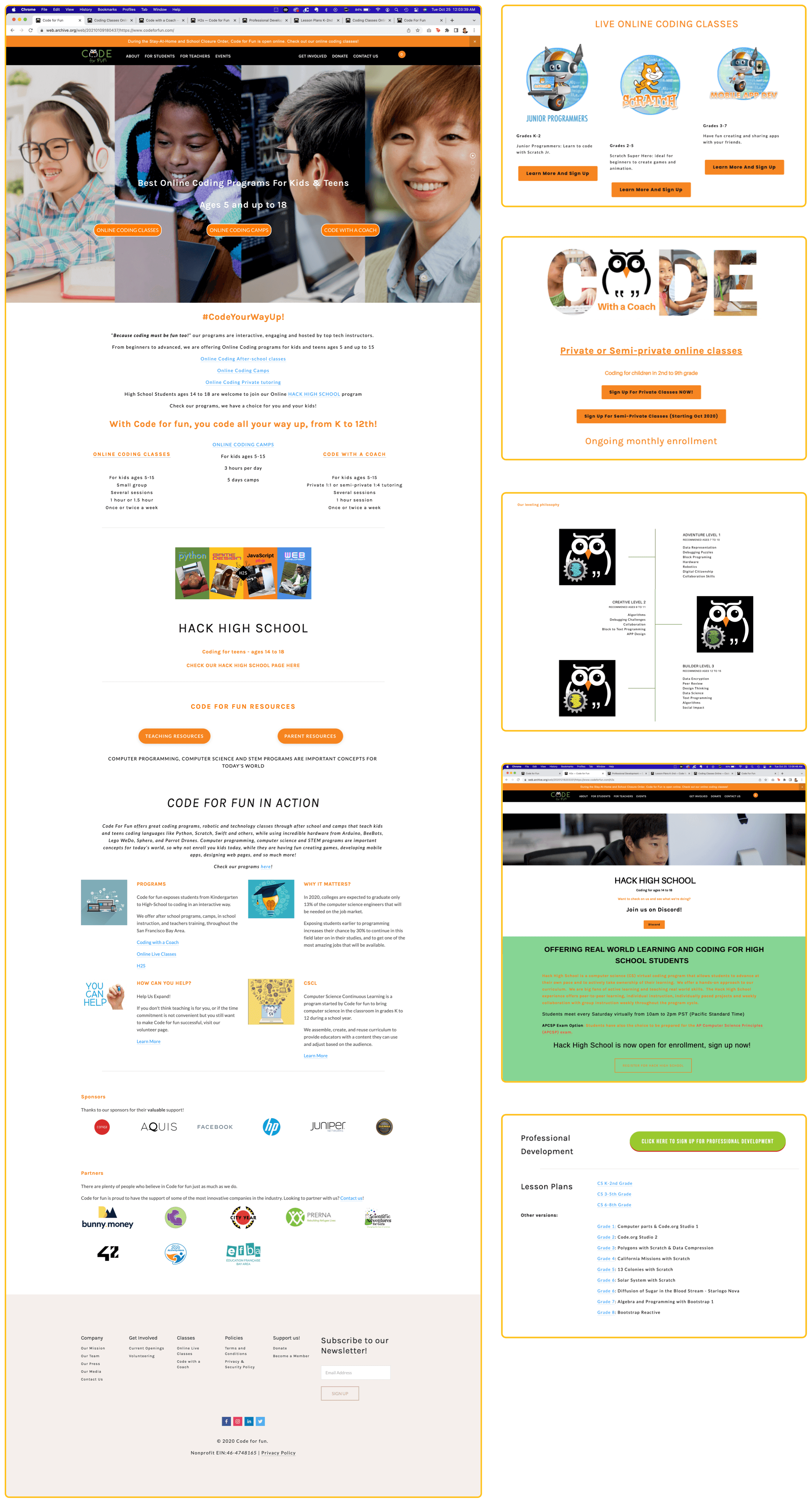
Original homepage and website snippets.
Research
Understanding The Customers
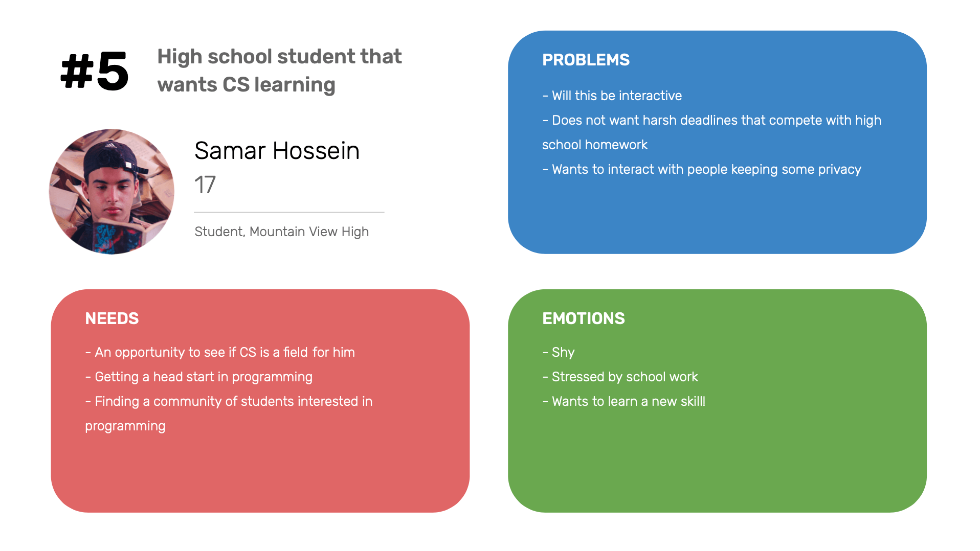
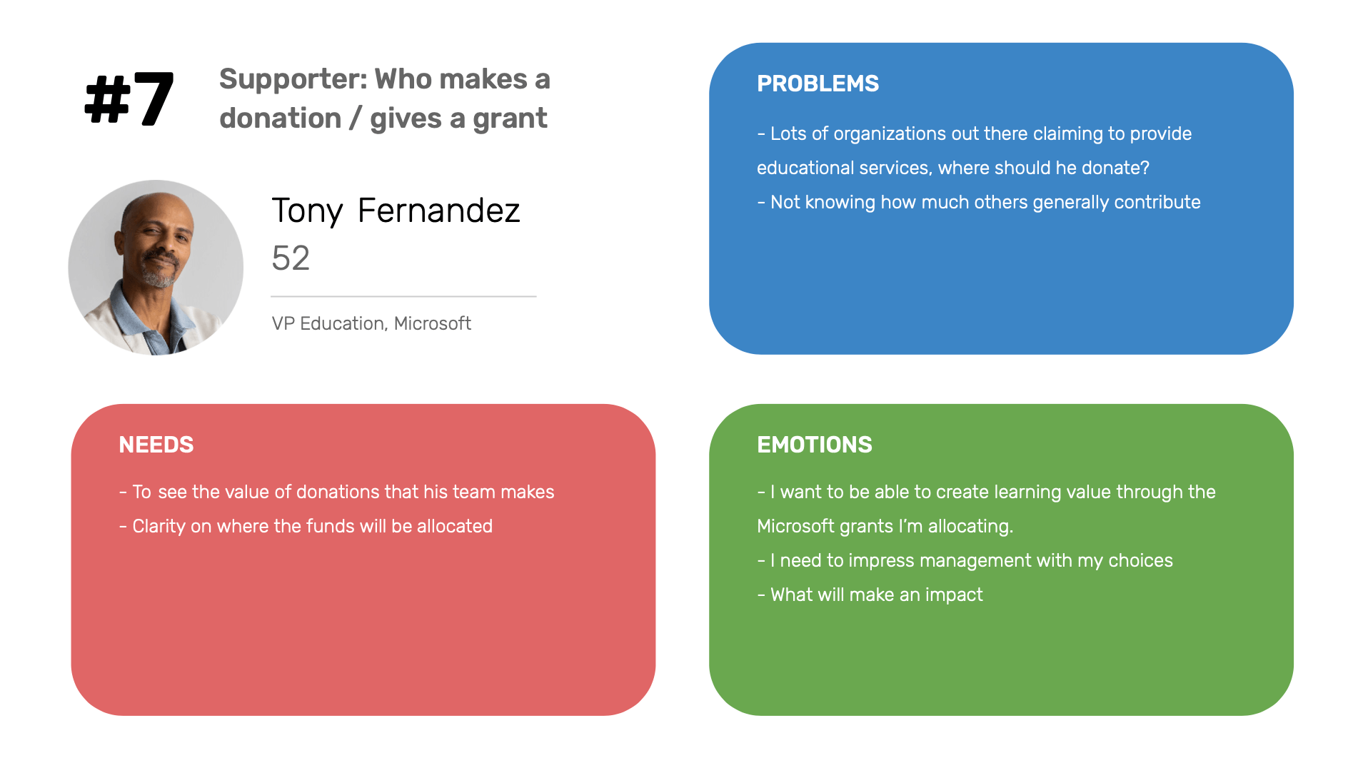
Through multiple stakeholder interviews, I was able to identify the 7 primary customer groups:


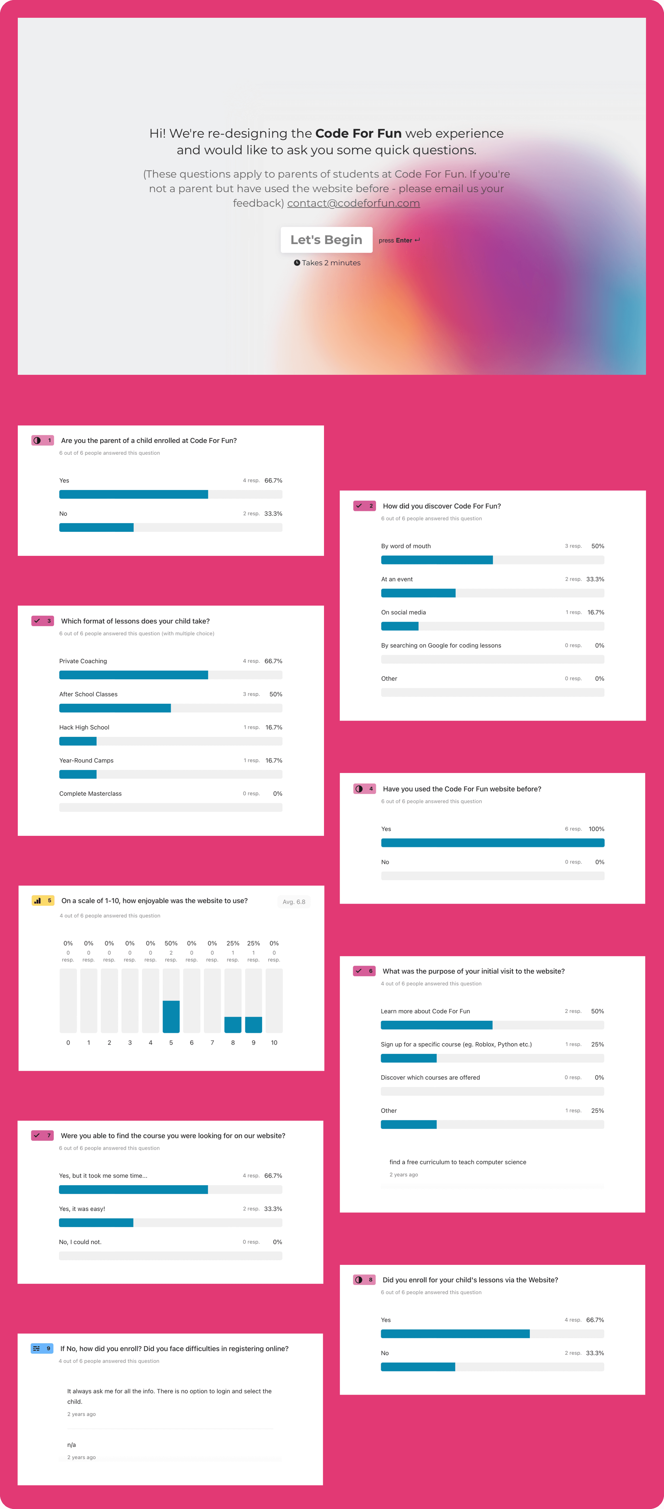
Surveying The Parents
The team and I put together a Typeform survey to get direct qualitative feedback from CFF parents. Self-reported data is not 100% accurate and we received only 6 responses, but the exercise helped us validate our hypotheses.
Try the survey here.
Info. Architecture
Old Website
I logged and reviewed the total information across the old website. It allowed me to analyze the content blocks and refine (add, edit, delete) it for more coherent structure and communication.
View Content Audit
Competitive Analysis
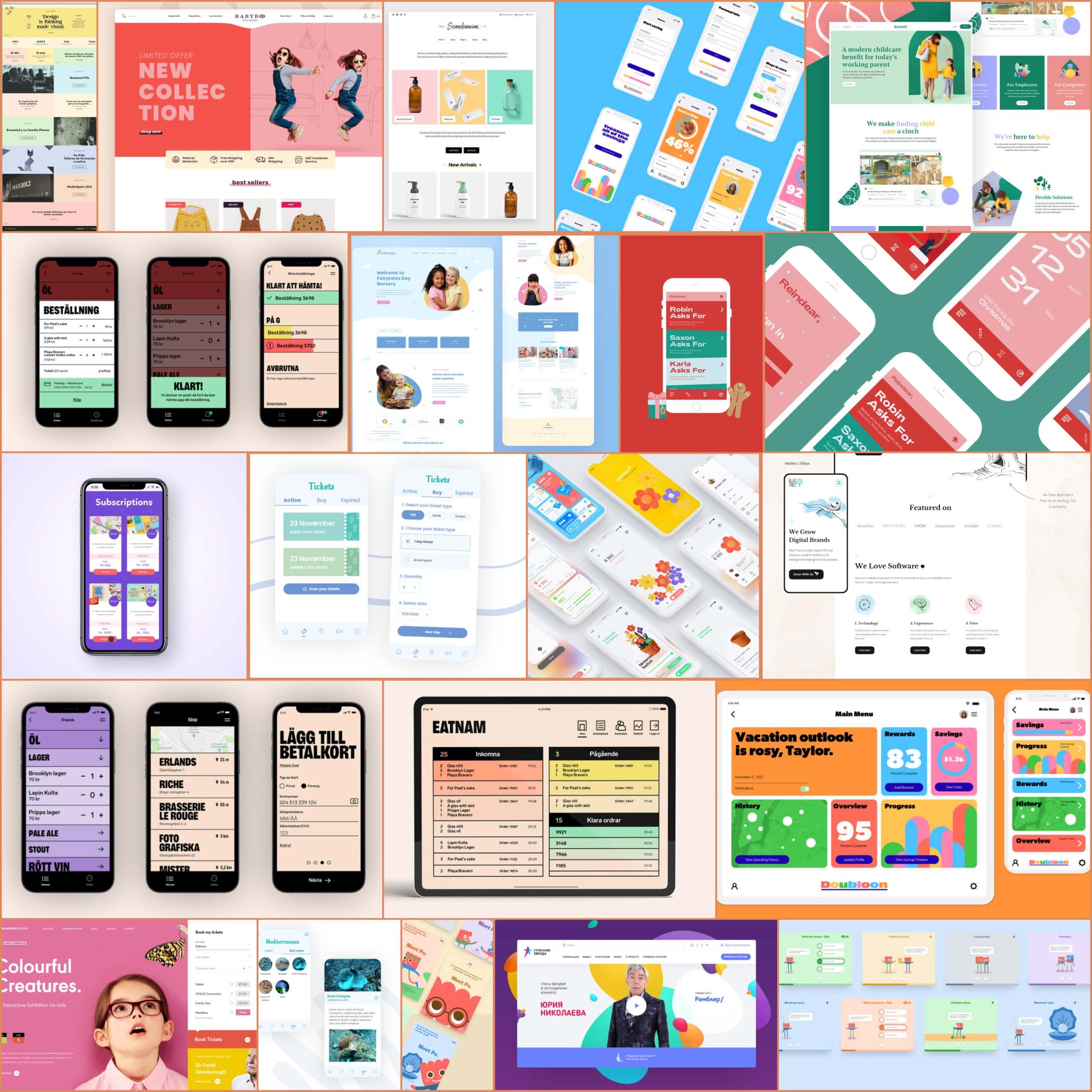
The CFF team helped me identify the competition, and I collected information and design parameters from direct competitors (companies operating in the exact same business & market) and indirect competitors (companies targeting the same user group - kids/parents), to understand the market and see where we could learn from, or improve upon the rest.
View Content Audit
View Competitor Design Document
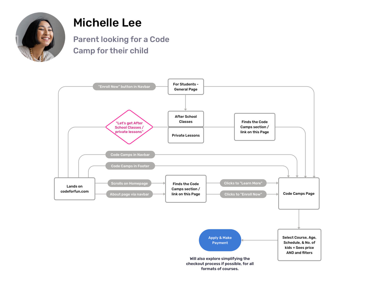
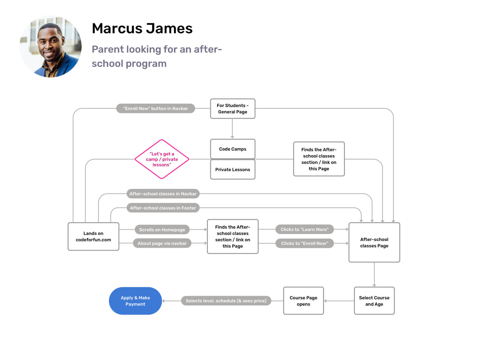
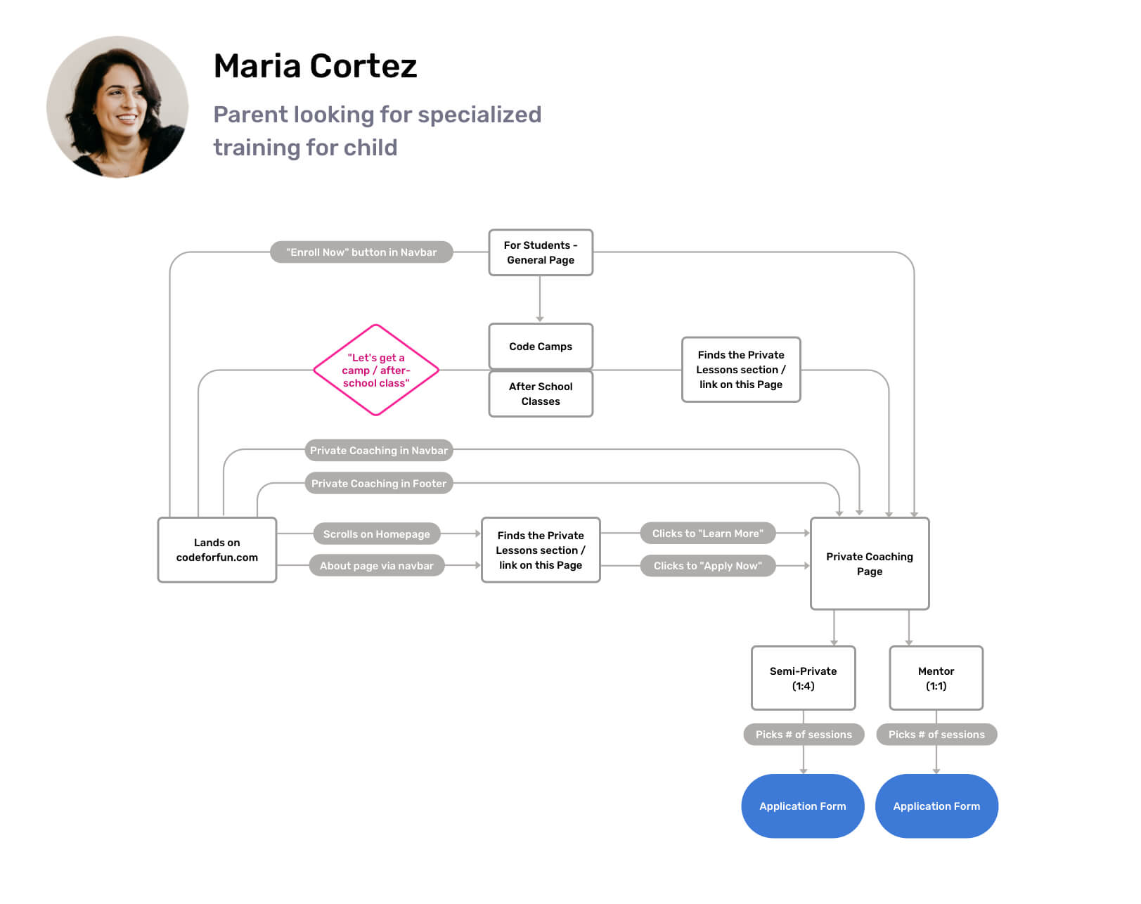
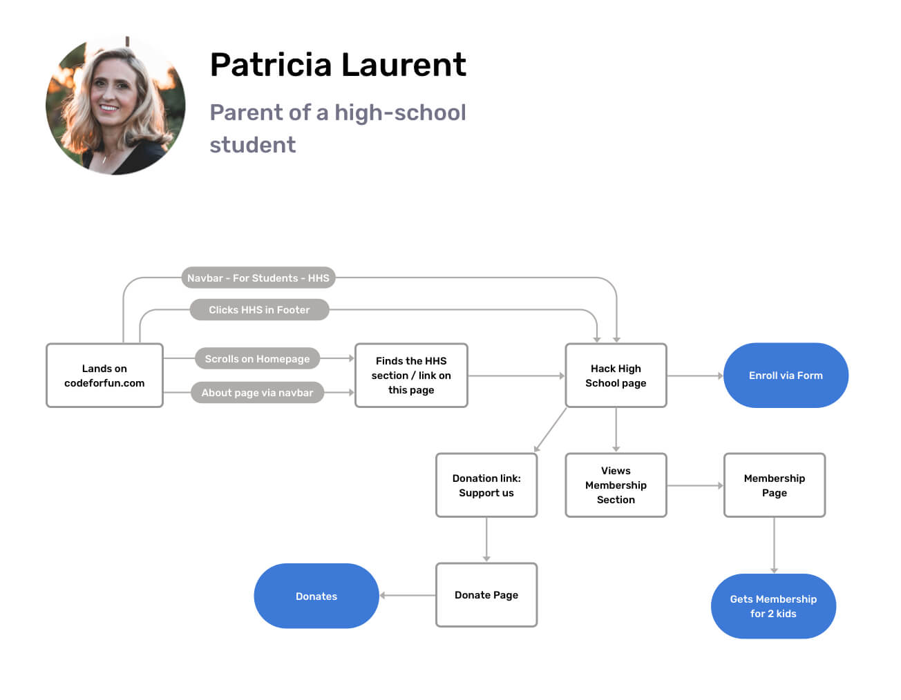
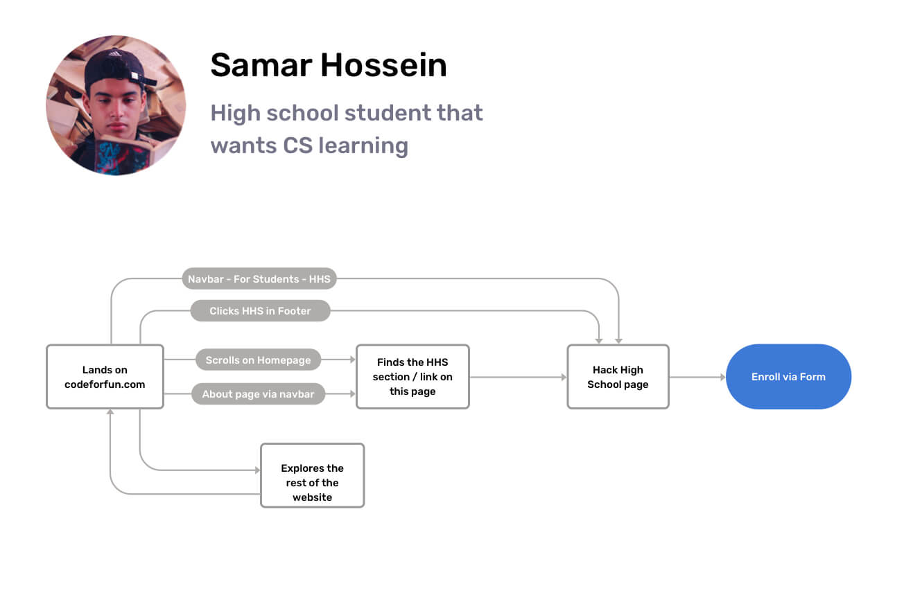
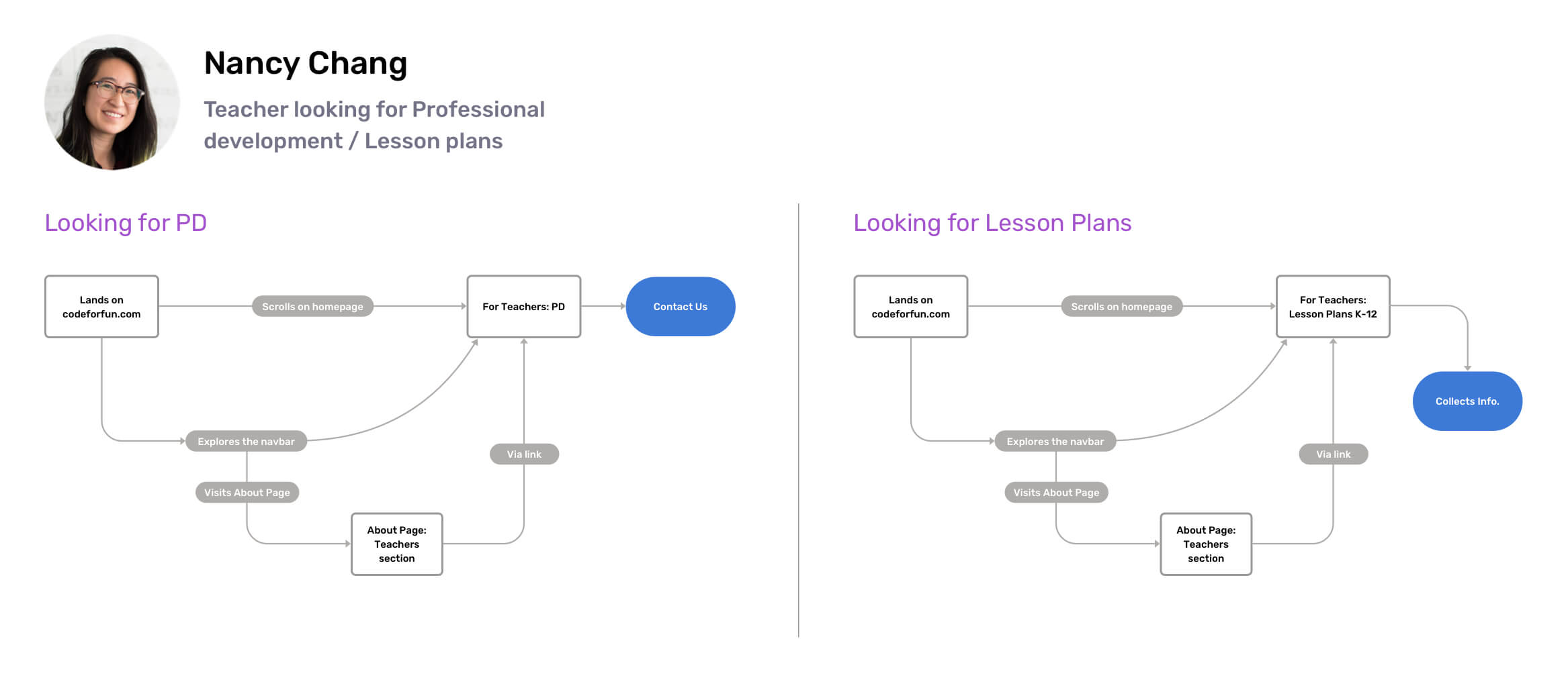
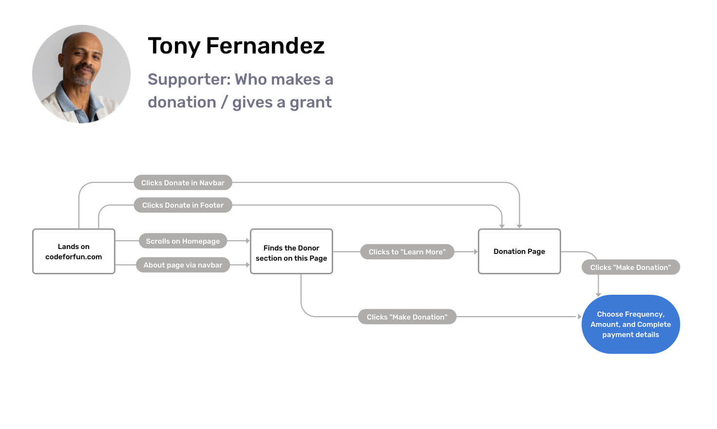
User Flows and Navigation
Mapping the journey of users to their objective (purchase, donation, etc.) - which will inform the site's structure in the next stage.
(Important to bear in mind, that the actual content blocks on the pages will be selected to solve the user needs / emotions outlined on the personas - while this is solely their paths to destination within the site.)
Final Content Blocks
Defining every content block's theme on every page of the site. To do this, direct competitors' content was analyzed, existing website content was considered, and new suggestions were made.
View Content Audit
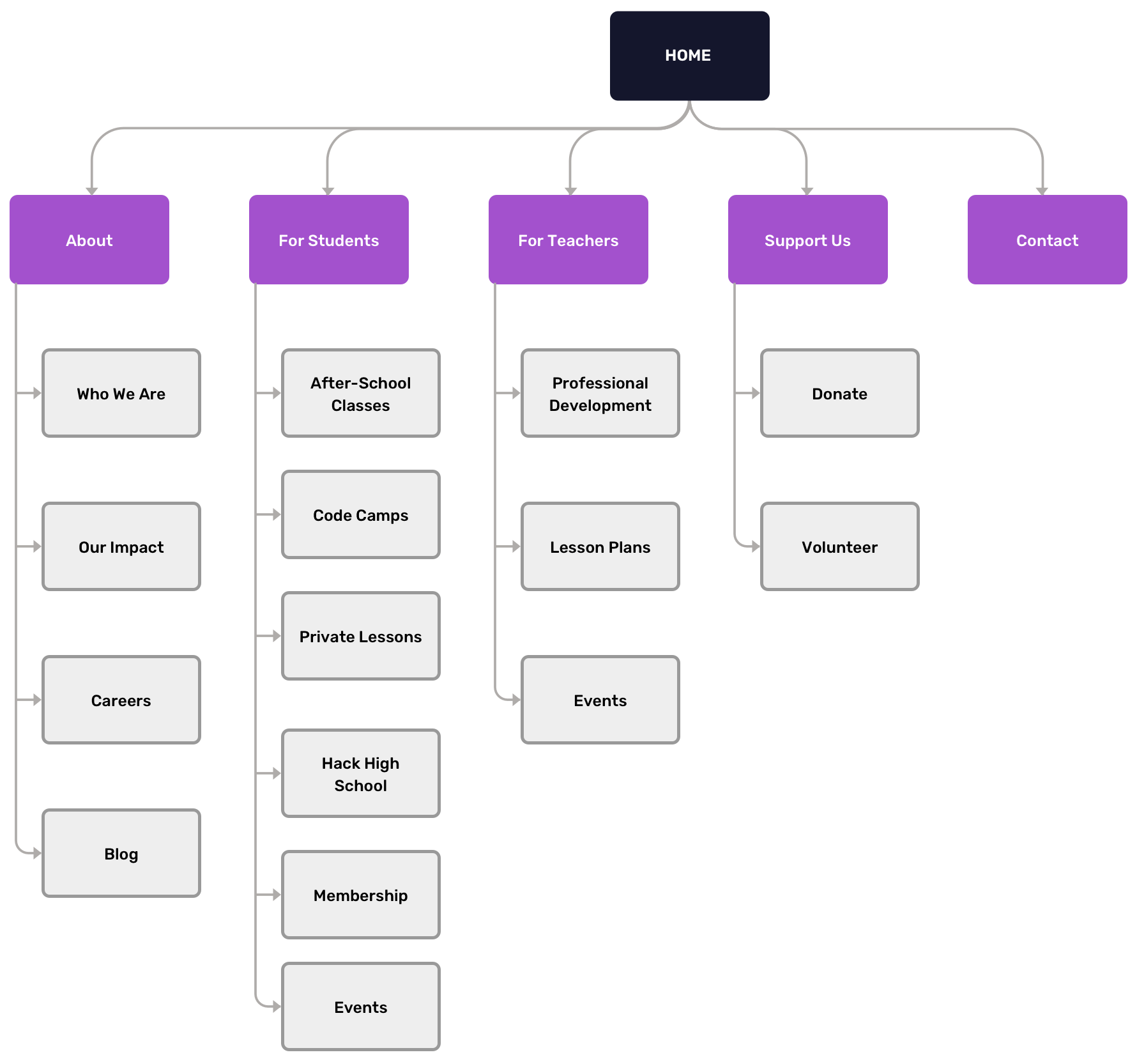
Sitemap
Design
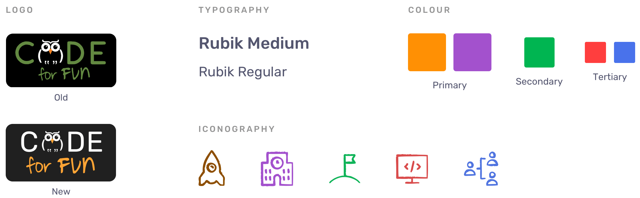
Moodboard
Colourful | Fun | Modern | Engaging
Visual Language
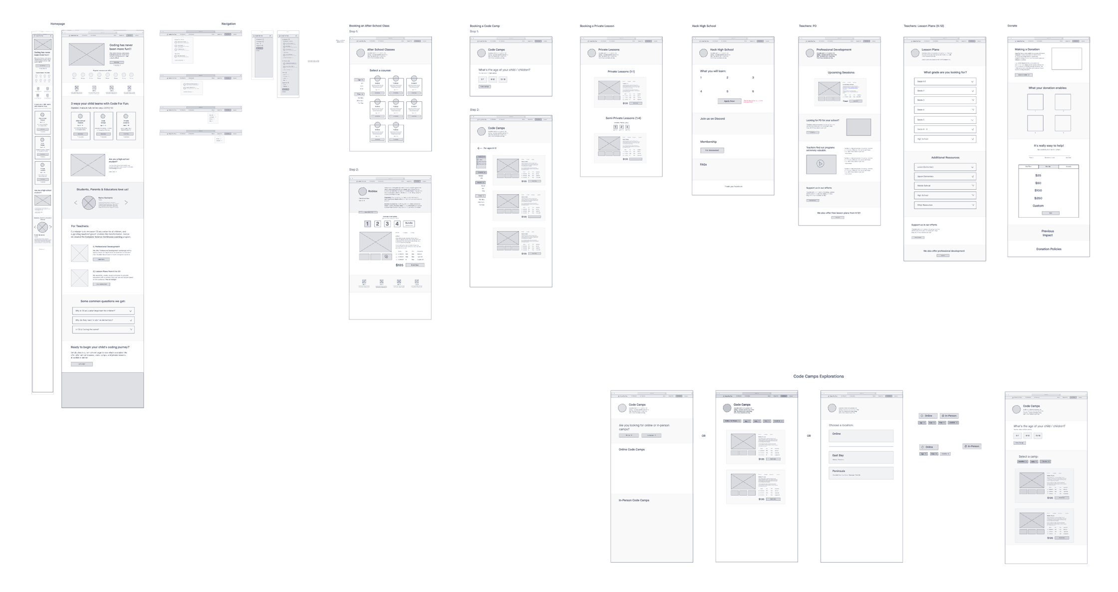
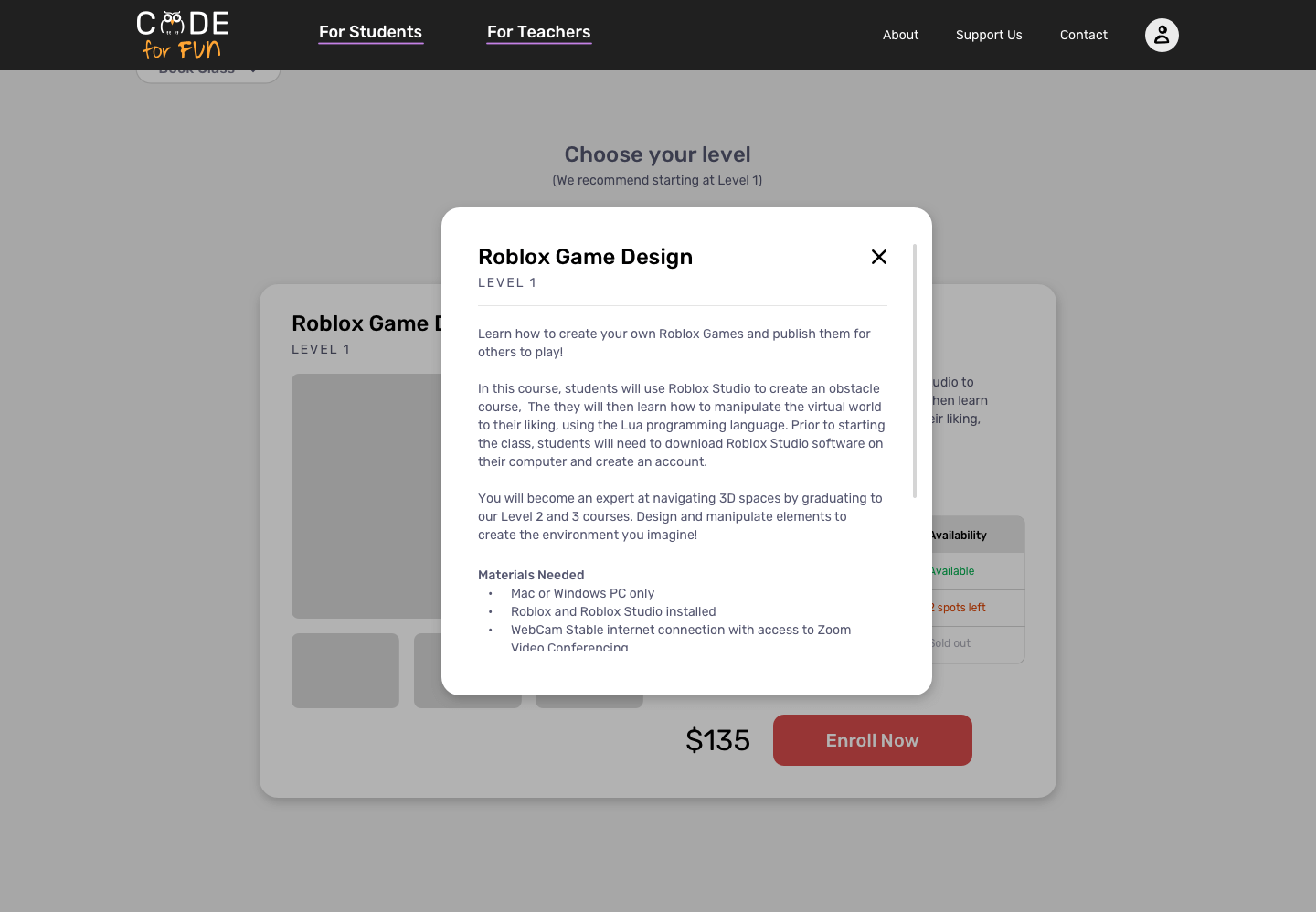
Wireframing
Sketched out the interface elements for key pages and interactions (eg. homepage, product pages, navigation, etc.), making every user task easy to accomplish and pleasant to use.
View Wireframe
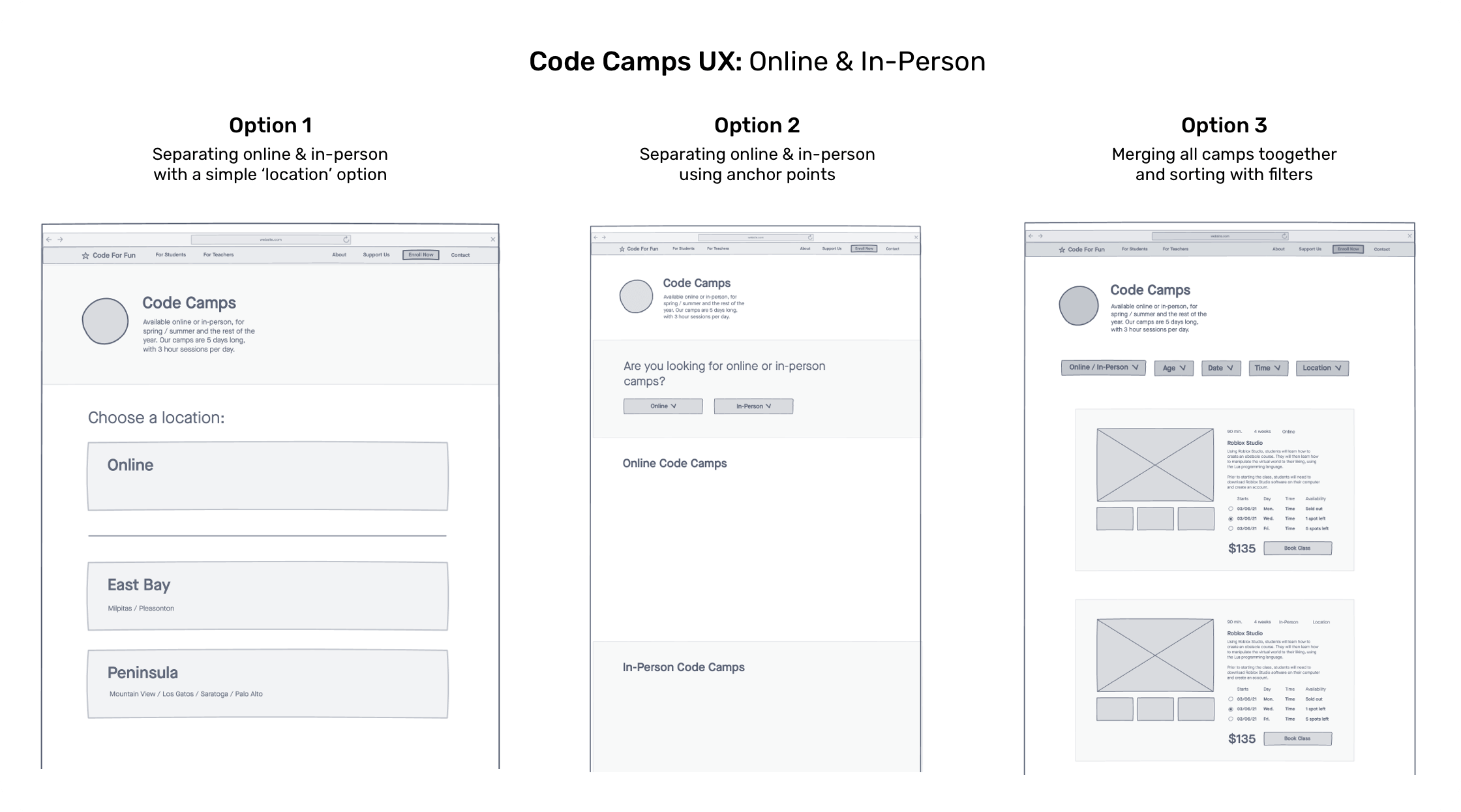
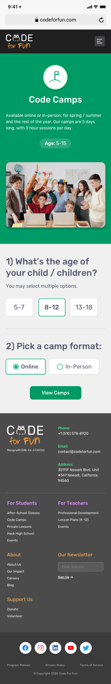
Explorations to solve the Code Camps interface, as presented to the client. A different direction was taken eventually.
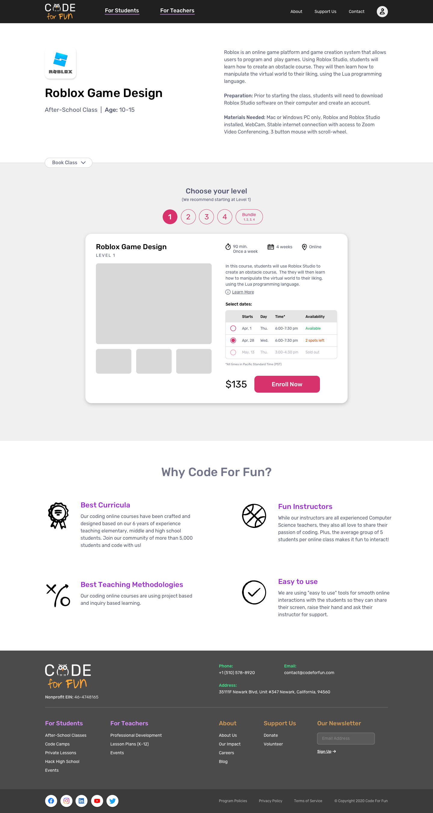
Visual + Interaction Design
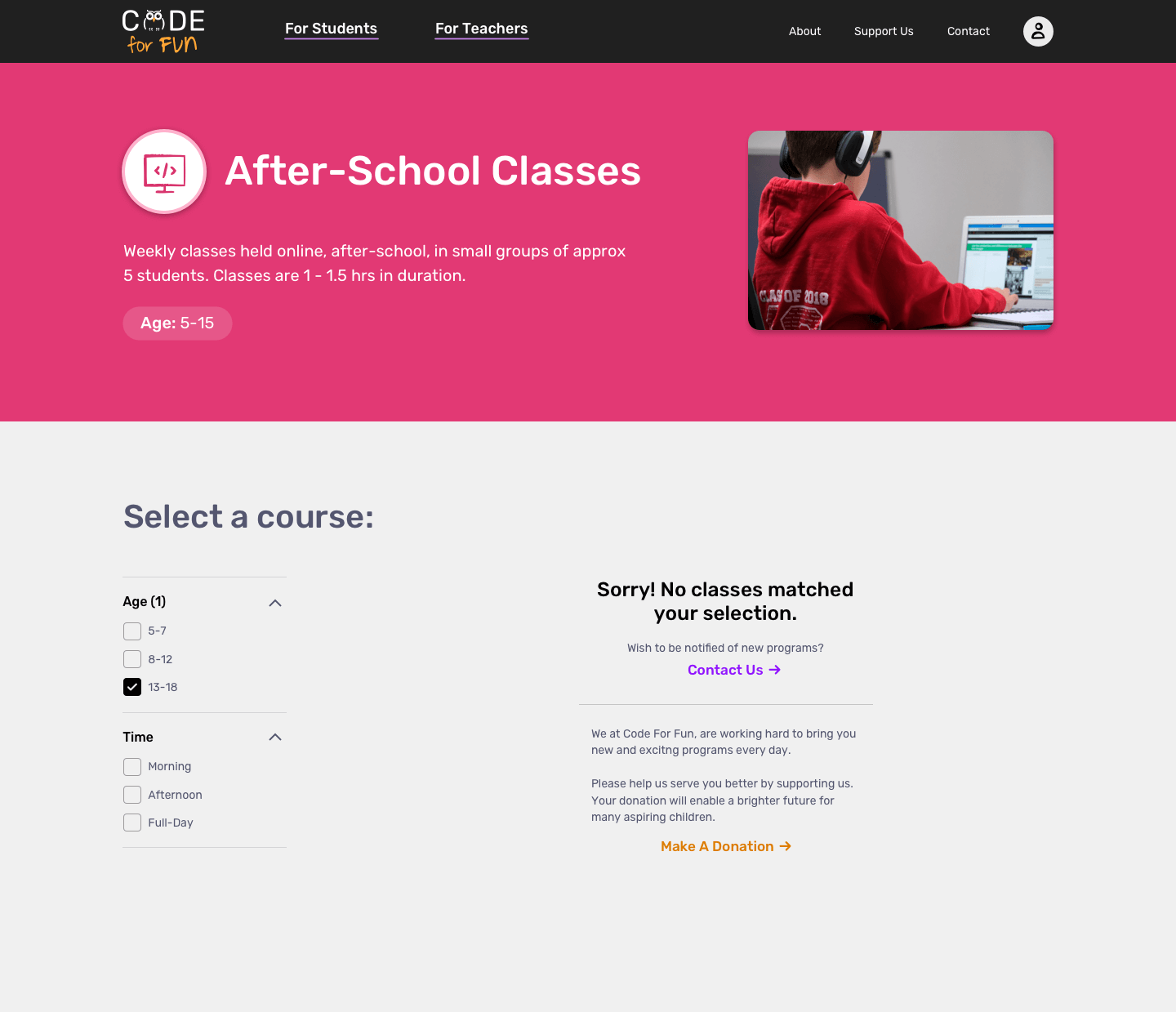
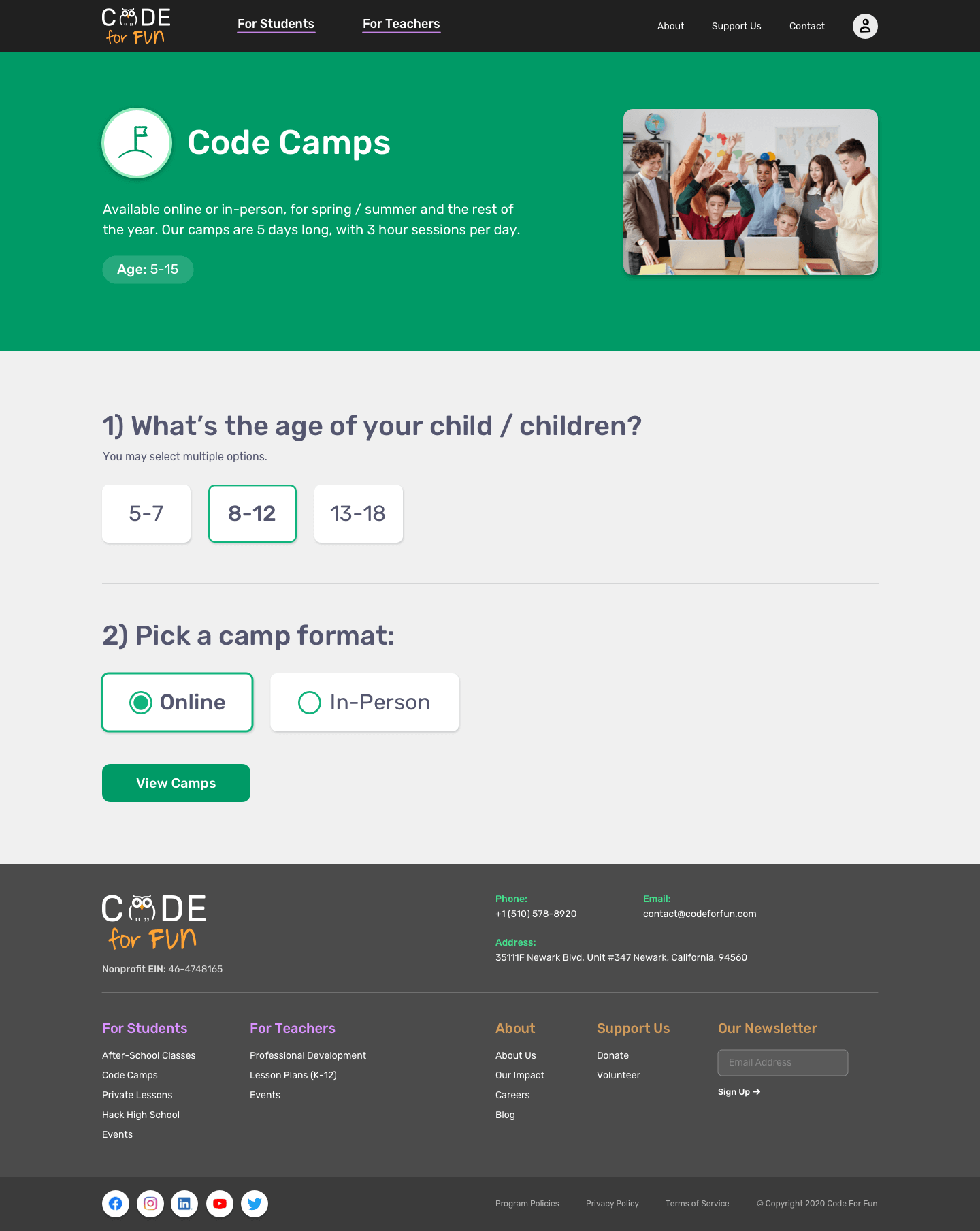
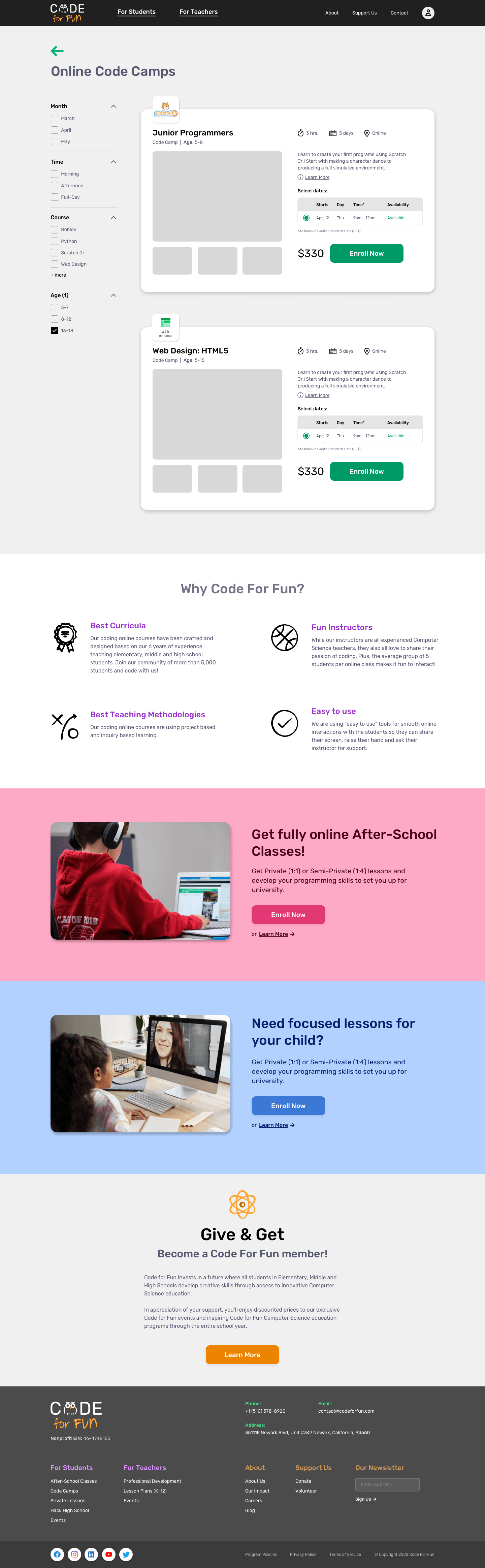
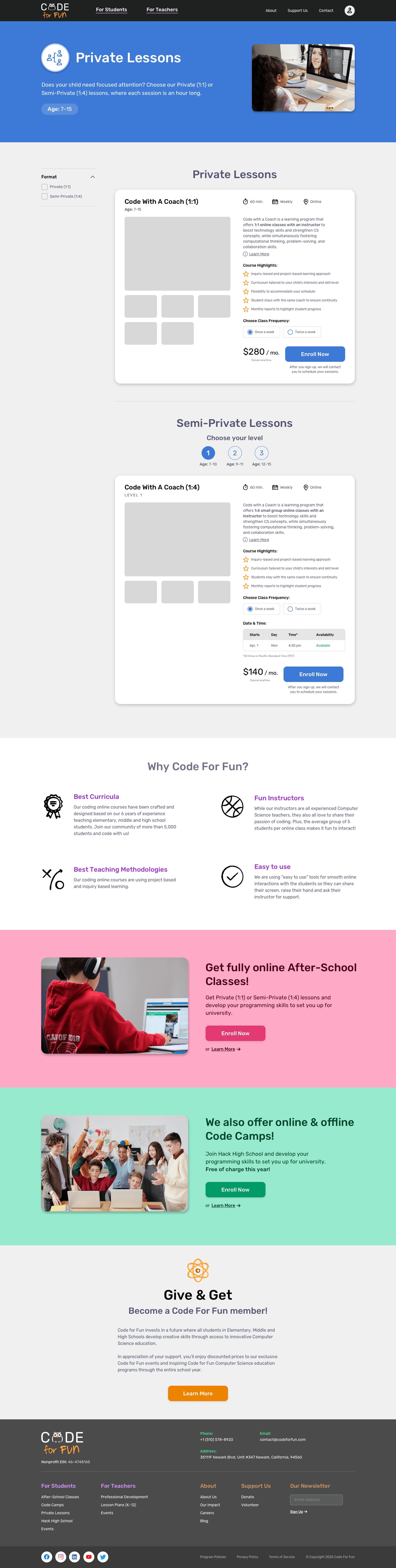
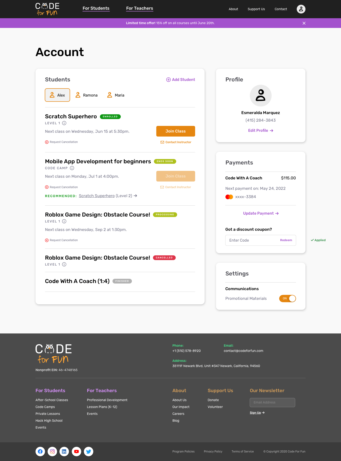
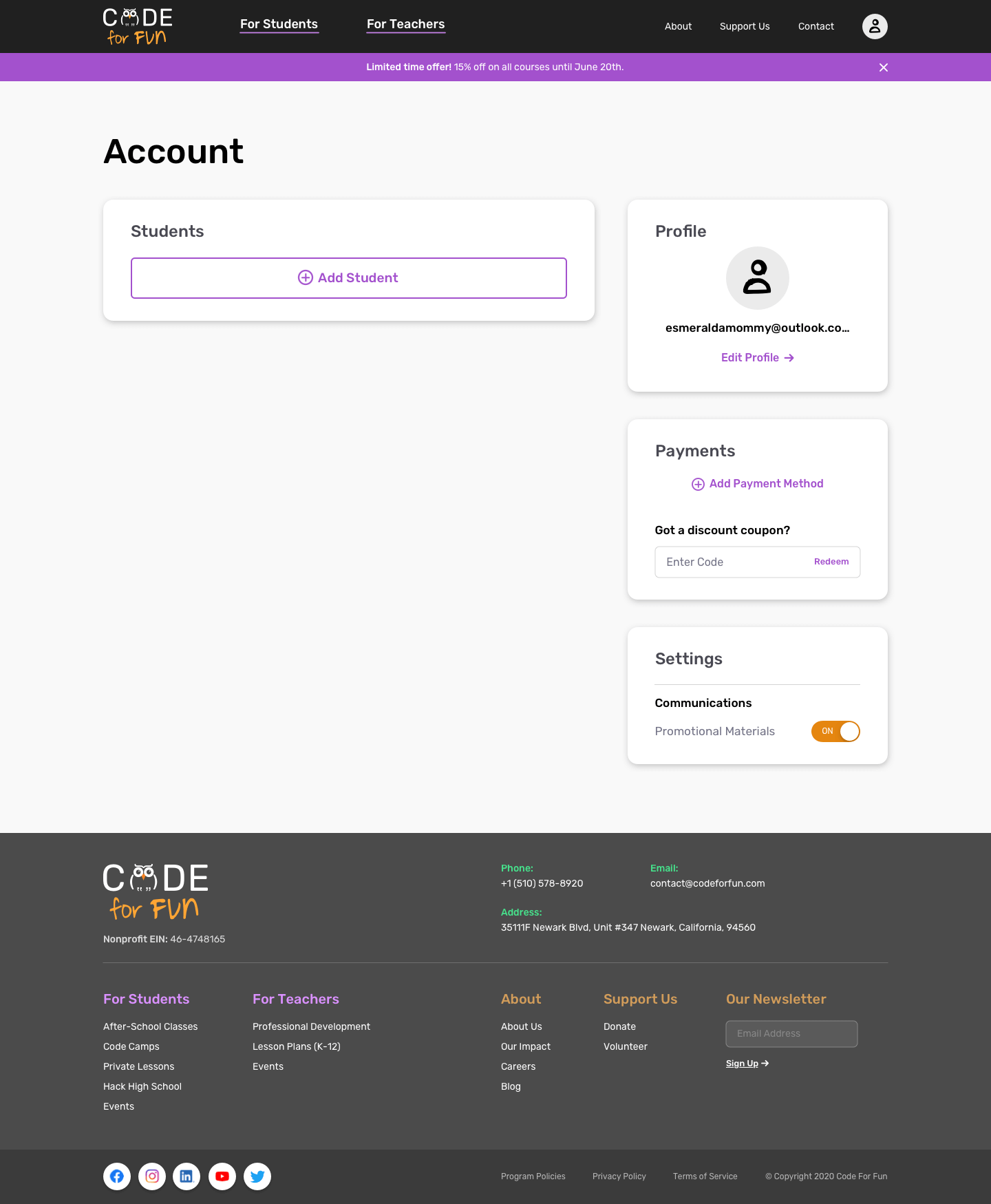
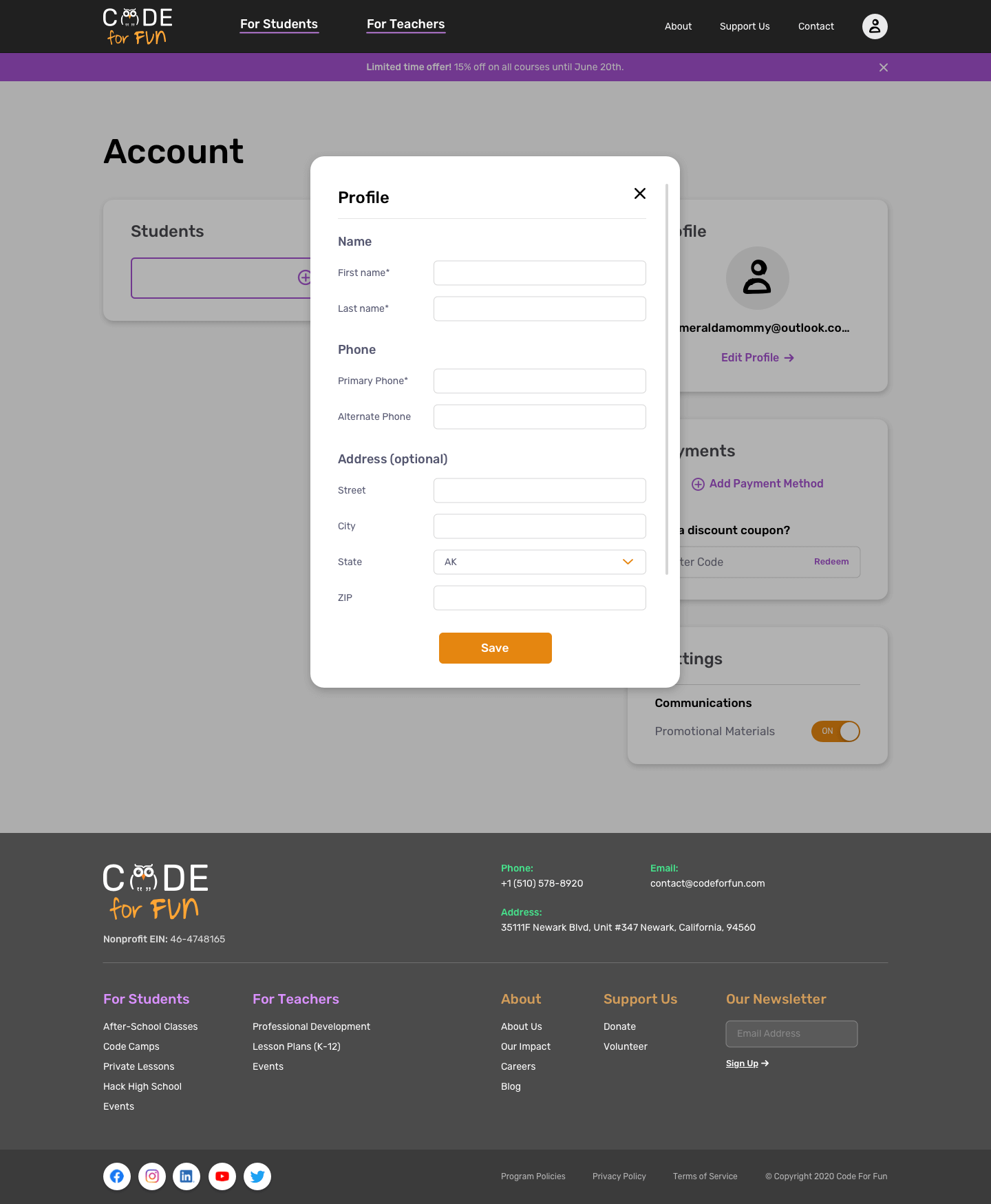
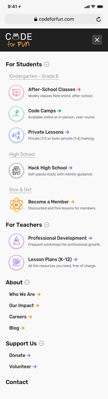
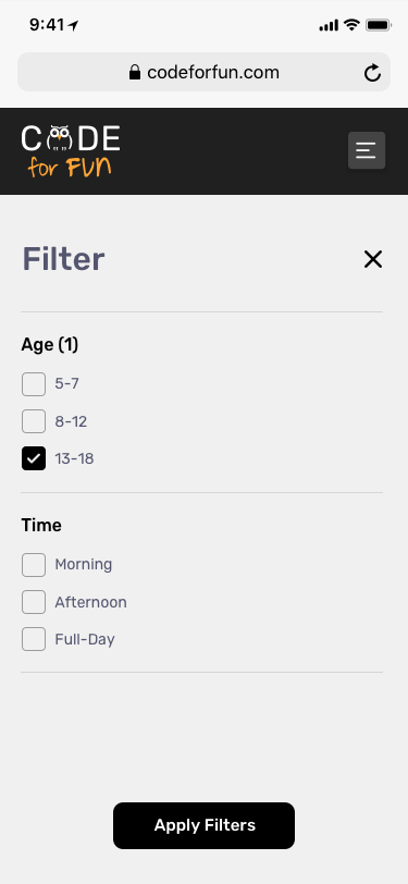
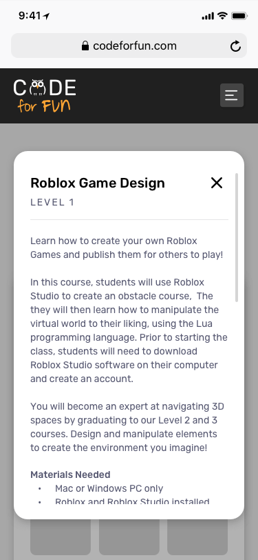
The new website design is in development, and the sample videos below are taken from the work-in-progress. Interactions were kept light and simple, described in comments as part of the delivery. I've supported the team in assuring quality while they're building the site.
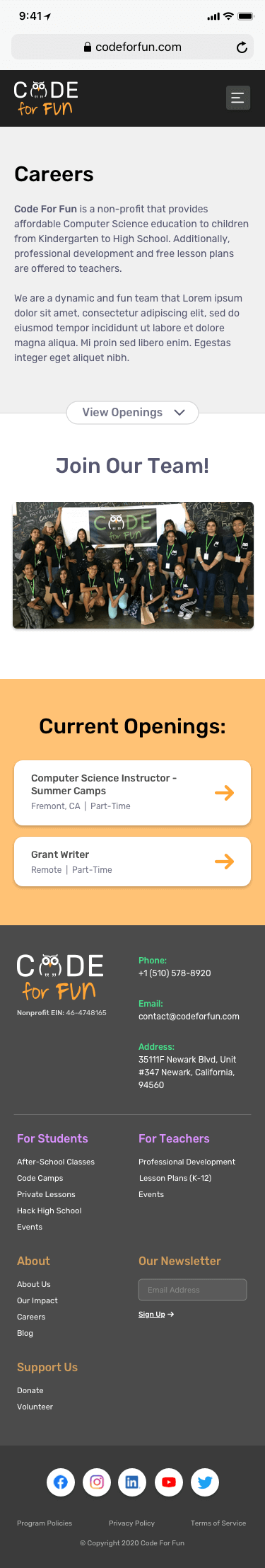
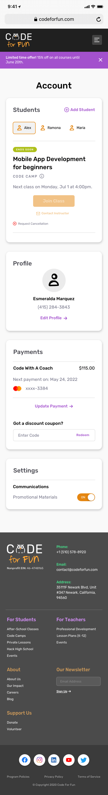
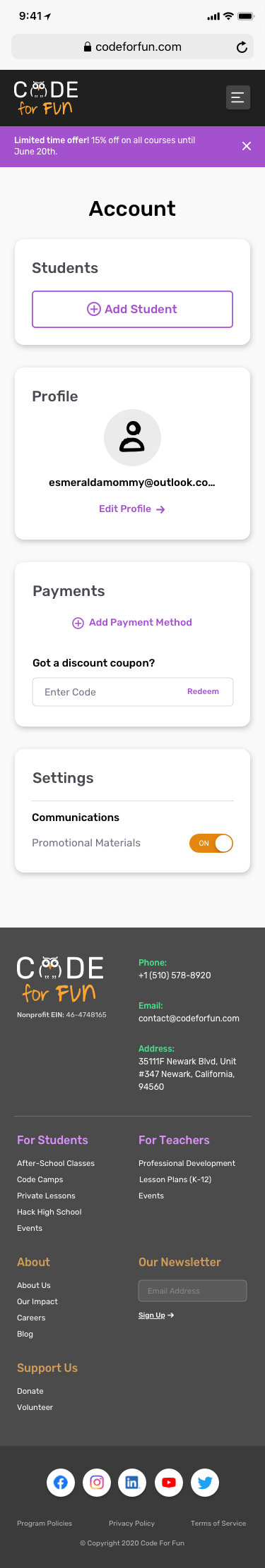
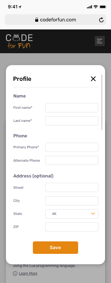
Click on the images underneath to view pages in detail!


Learnings
- I made a late delivery due to a lengthy 'empathize' and 'define' phase. In retrospect, I would create further clarity in my project plan to be more efficient.
- Anticipate research exercises ahead of time so as to collect a larger quantity of data points for insights. The survey I created was a bit rushed and was sent out at an inconvenient time of year, hence lacking adequate results.
- Excited to hear feedback from Servane and the team once the site is completely built, ready for testing, and in the hands of customers. Did we meet the goals we set out to accomplish?
Next Project: Acko Insurance →
Next Project: Acko Insurance →